B2B SaaS App, 4 months
Reports and insights for print environments
Reports in a print management application provide valuable assistance and confirmation of value to the business by providing comparative insights into cost, waste reduction, and security issues. As the initiative’s design lead, I provided end-to-end help in developing a high-quality reporting and insights tool for consumers.

My role
- Discovery: 2 week
- Ideation and Design: 2 weeks
- Prototyping and Testing: 2 weeks
- HTML prototype refinement: 1 weeks

Team
- Design Lead (myself), Product lead (Keith), Dev lead (Shalini), Front-end dev (Mat), and 6 Devs
- Tools: Miro, Figma, Draw.io, Google Charts

Business goals
- Win tenders where print-report is a table stake
Product goals
- Increase conversion using reports as a leaver
- Empower admins to investigate without getting lost
Final outcome
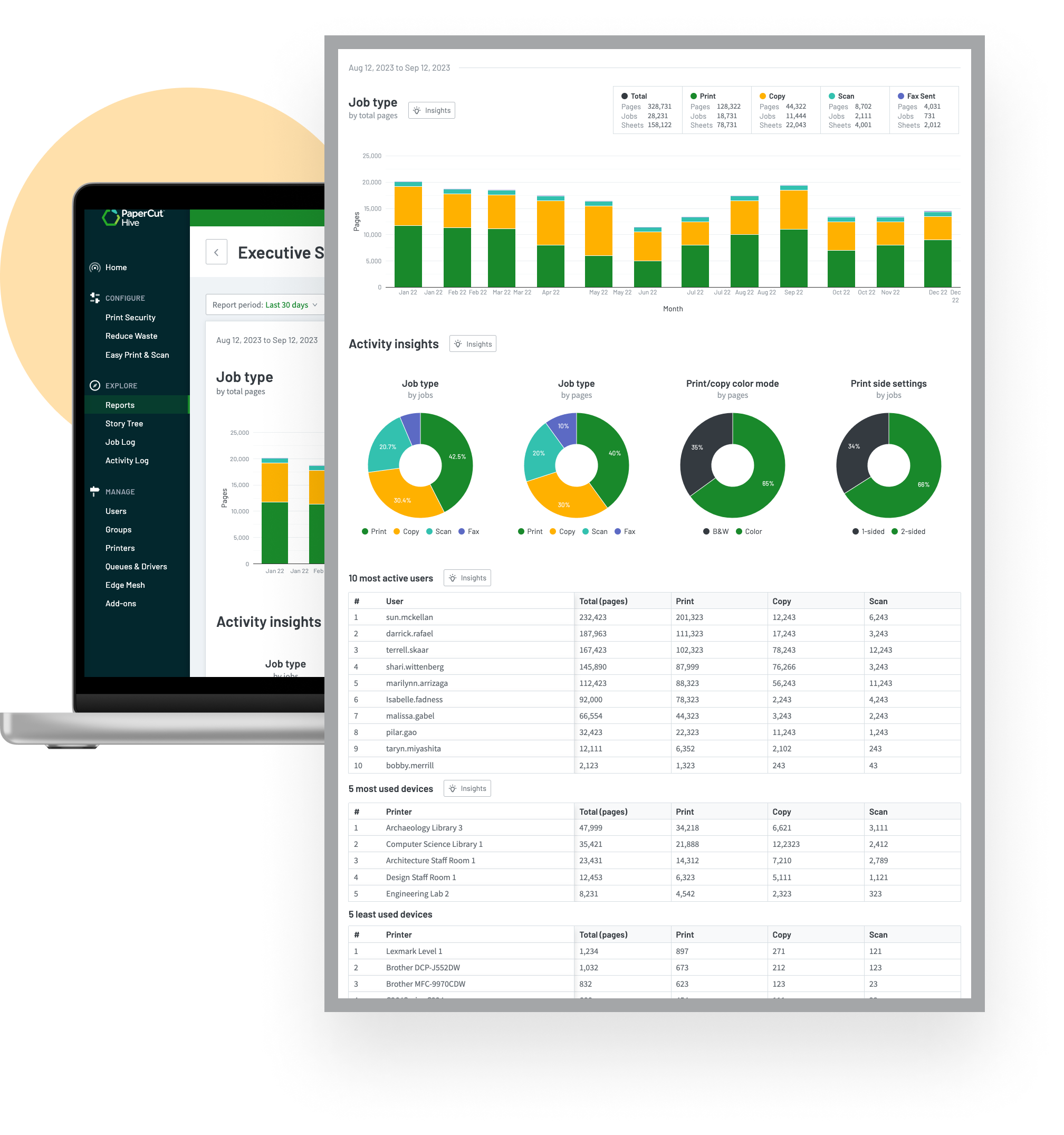
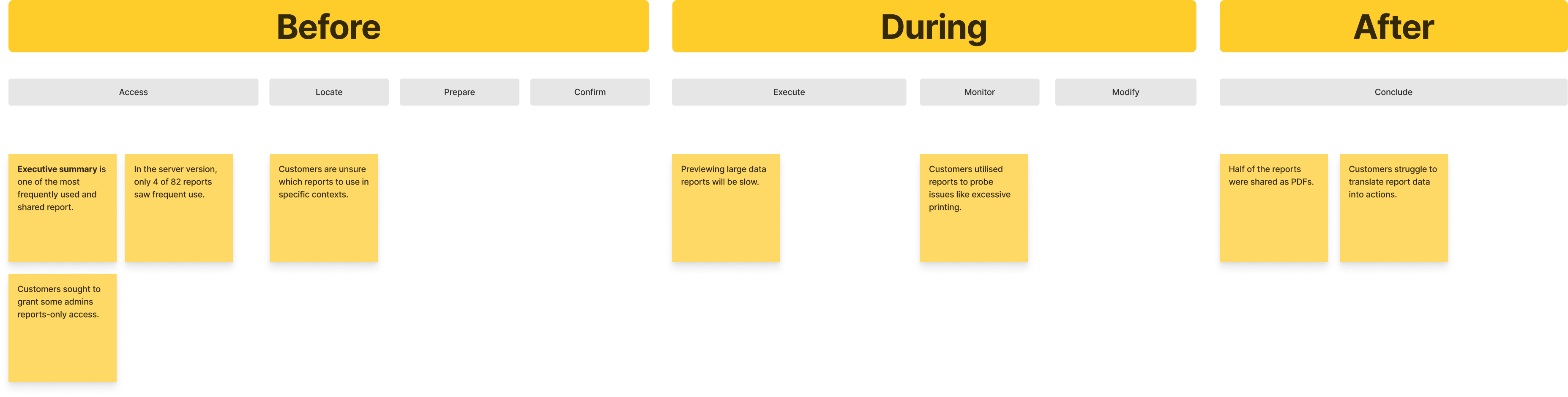
In the absence of reports
In the absence of reports, the admin struggled to convert available data (job-log) into meaningful insights, and lacked an ability to spot usage anomalies (e.g. print abuse) or trend-lines to forecast future usage.
Why do reports matter?
For business
- Its a table stake, our competitors offer that.
- To provide an evidence of value prop we offer.
- Confirm ROI to decision makers.
- Influence customers to continue to subscribe.
For customers
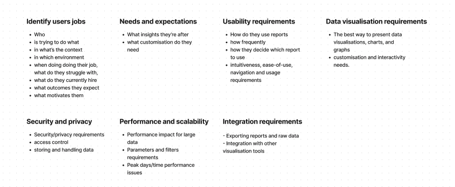
- Need to learn: What jobs are customers trying to do using reports.
- Investigate: What’s the context of use.
- Investigate: What’s usage frequency.
- Investigate: What alternates do they employ in the absence of reports
Project inception
The inception phase marked the formal launch of the initiative, where product owner, directors, and the product trio (PM, UX Lead, and Dev Lead) collaborated to define our goals and key areas of investigation.
Discovery
Customers and partner interviews
A 2-week long discovery session included interviewing: 4 partners/resellers and 7 customers scattered across Australia, Europe and Americans with a view to understand jobs, context, needs, wants, and desired outcomes.
Synthesis of user feedback
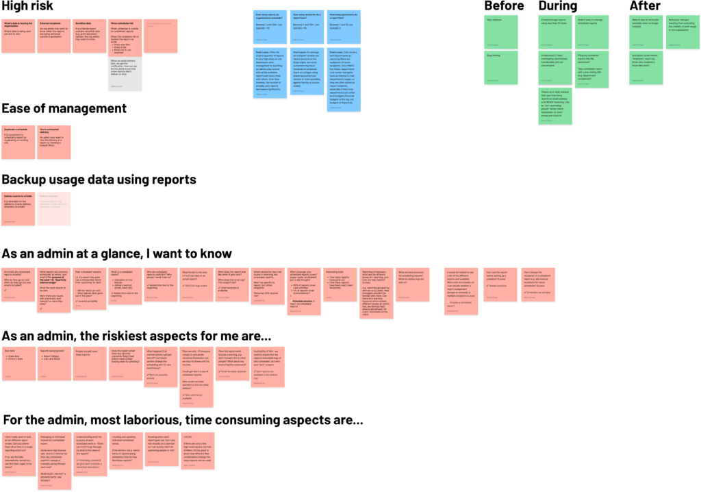
I analysed user insights from multiple angles to pinpoint risky, error-prone, and time-consuming processes.
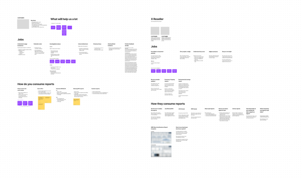
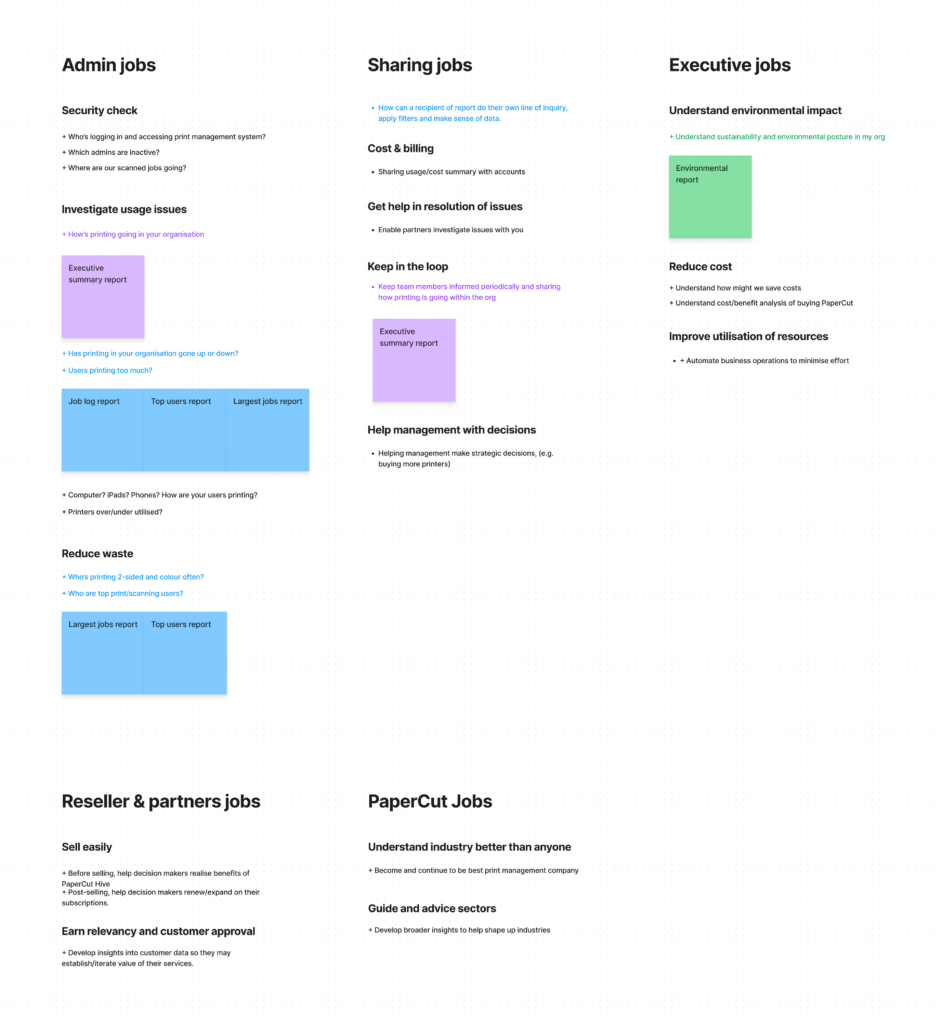
Key jobs users are trying to do
Key learnings from research
Admins
- Admins lack knowledge and expertise to interpret reports data into actionable steps.
- Admins struggle to find opportunities to reduce waste or save cost.
Executives
- Executives are interested in statistics confirming ROI.
- Timely access to insight is key.
Resellers
- Resellers offering trials struggle to generate statistical evidence of ROI and benefits.
Learning from competitors
A deep dive into four key competitors revealed their strengths and weaknesses in providing insightful reports and visualising the big picture.
This analysis had a direct impact on both our design decisions and marketing strategy. We leveraged this knowledge to ensure our reporting solution delivers superior value and stands out in the market.


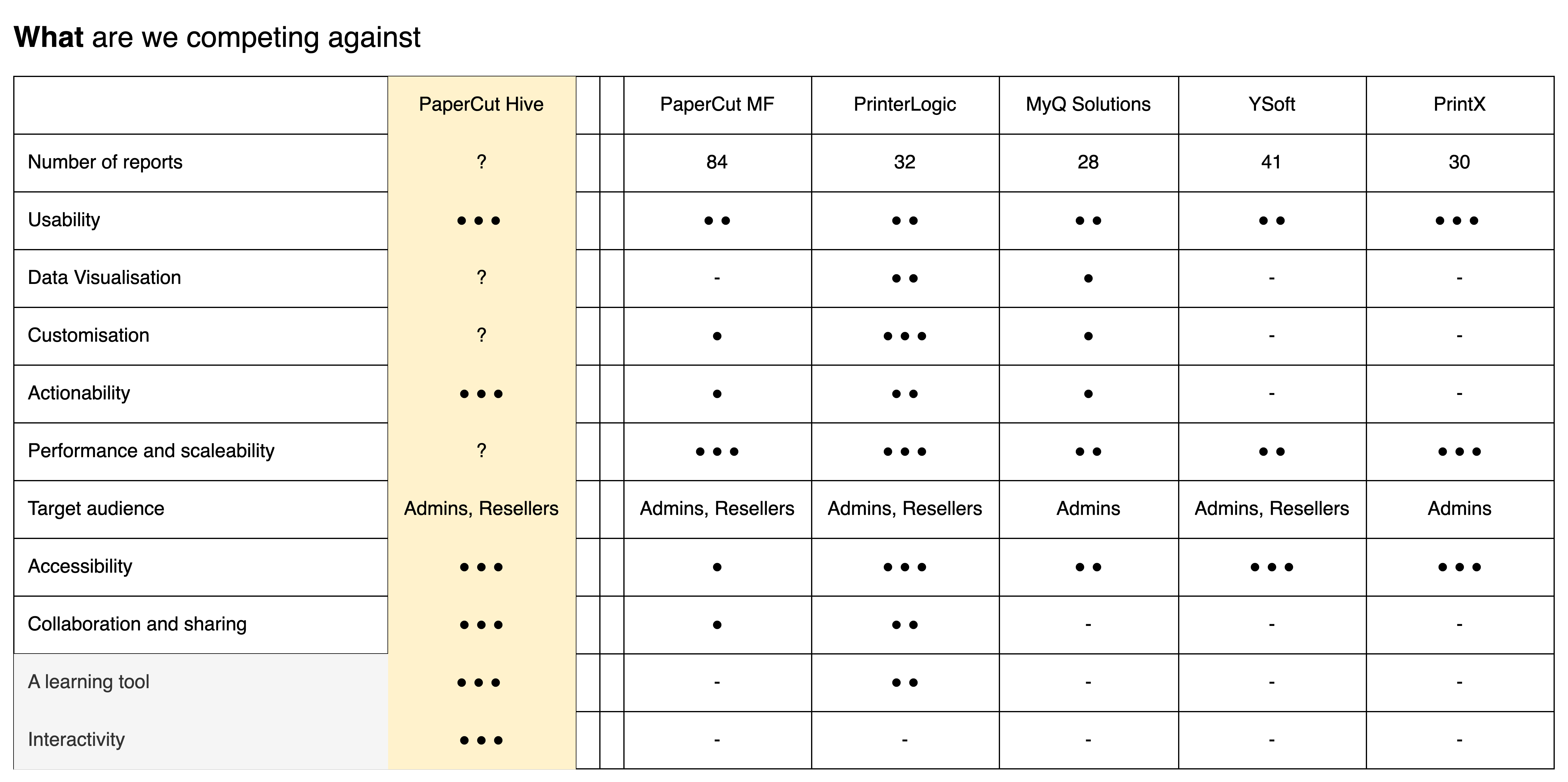
Key learnings from competitors
- Customisation and actionability of report is uncommon
- We’re behind in performance and scaleability
- Interactive reports can be a value differential
Learnings from the non-competitors
To gain inspiration, I broadened my research beyond the print management space, studying leaders in data visualisation and analytics like Google Looker Studio, Metabase, and Binance. This approach fuels innovation, expands our perspective, and encourages us to learn from industry leaders, driving us to surpass competitive offerings.
Key learnings from non-competitors
- Looker studio offers one of the best interactive reports
- Maximise availability of screen realestate
- Bubble up frequently used reports to the top of the list
Ideation
How might we help admins identify waste reduction and cost saving opportunities, giving them actionable insights and advice they could apply?
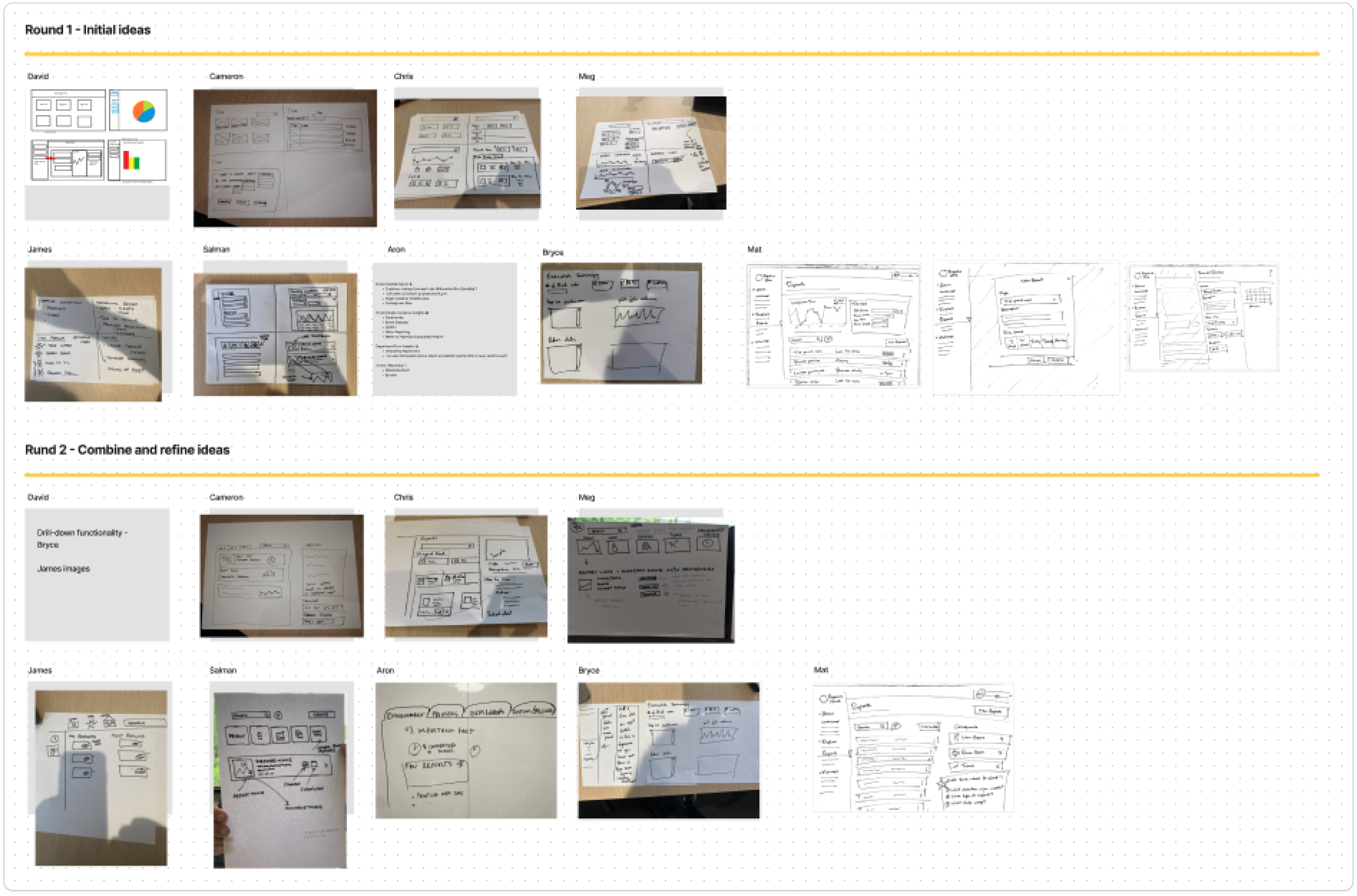
I conducted at 4up ideation session with the team inviting members from technical support, marketing and PMs from server-based products to brainstorm thoughts how might we provide a solution to key problem areas identified in the discovery phase.
Functionality mapping
Functionality mapping is a powerful tool for understanding the relationships between different entities within a complex system, particularly those involving shared operations and processes. By visualising these connections, we can identify potential bottlenecks, redundancies, and opportunities for optimisation.
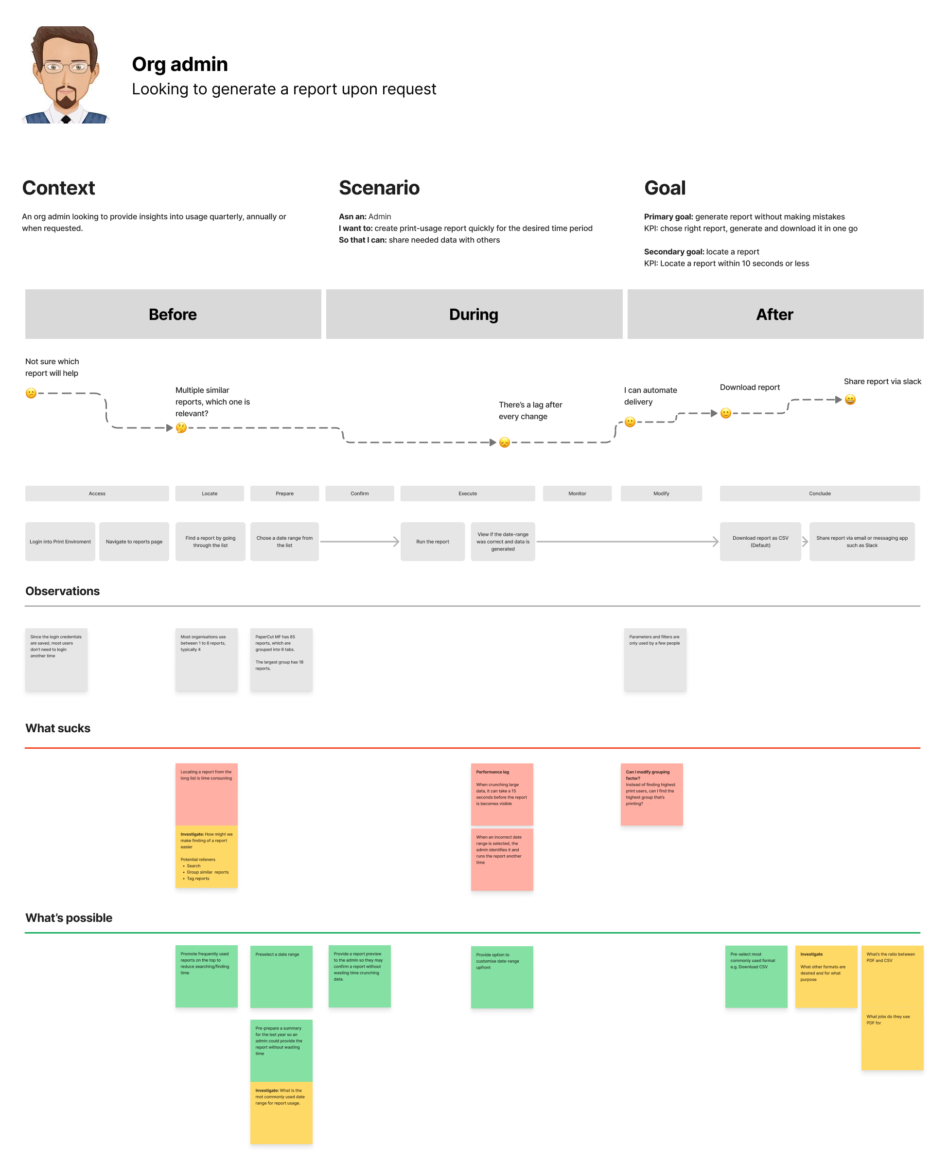
Low-fi Wirframes
I used low-fidelity wireframes to explore multiple solution pathways for this challenge. Presenting various options allowed the team to assess them based on key criteria, steering the design toward the most intuitive, scalable, and build-efficient solution.
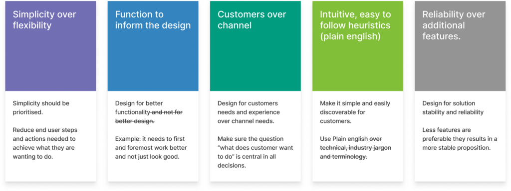
Our guiding principles were:
- Prioritize an intuitive flow with a low learning curve.
- A report must be downloadable within 3 clicks.
- Favor simplicity over excessive flexibility.
Evaluation with stakeholders
At this stage, the solution is starting to take shape and I seek extensive input from the Trio, product owner, SME and marketing lead to ensure:
Technical Validation: Ensuring proposed solution is feasible, scalable, and aligns with the product architecture.
Usability Confirmation: Verifying that the user flows are intuitive, address core pain points, and meet user expectations.
Business Alignment: Confirming that the solution supports key business goals, KPIs, and the overall product vision.
Messaging and Positioning: Crafting a compelling narrative about the solution’s value, ensuring consistency with marketing strategy.
Design
Design principles
Design principles function as a strategic compass, ensuring design decisions align with user needs, business goals, and the product’s overall vision. Rooted in a deep understanding of customer jobs, contexts, desired outcomes, and competitive offerings, these principles provide a clear framework for evaluating design choices.
Mid and high fidelity design
After careful consideration, I choose a design solution to undergo further refinement. When uncertainty or divided opinions arise, I mature multiple design solutions and conduct A/B testing for informed decision-making.
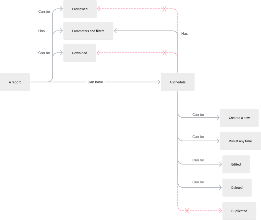
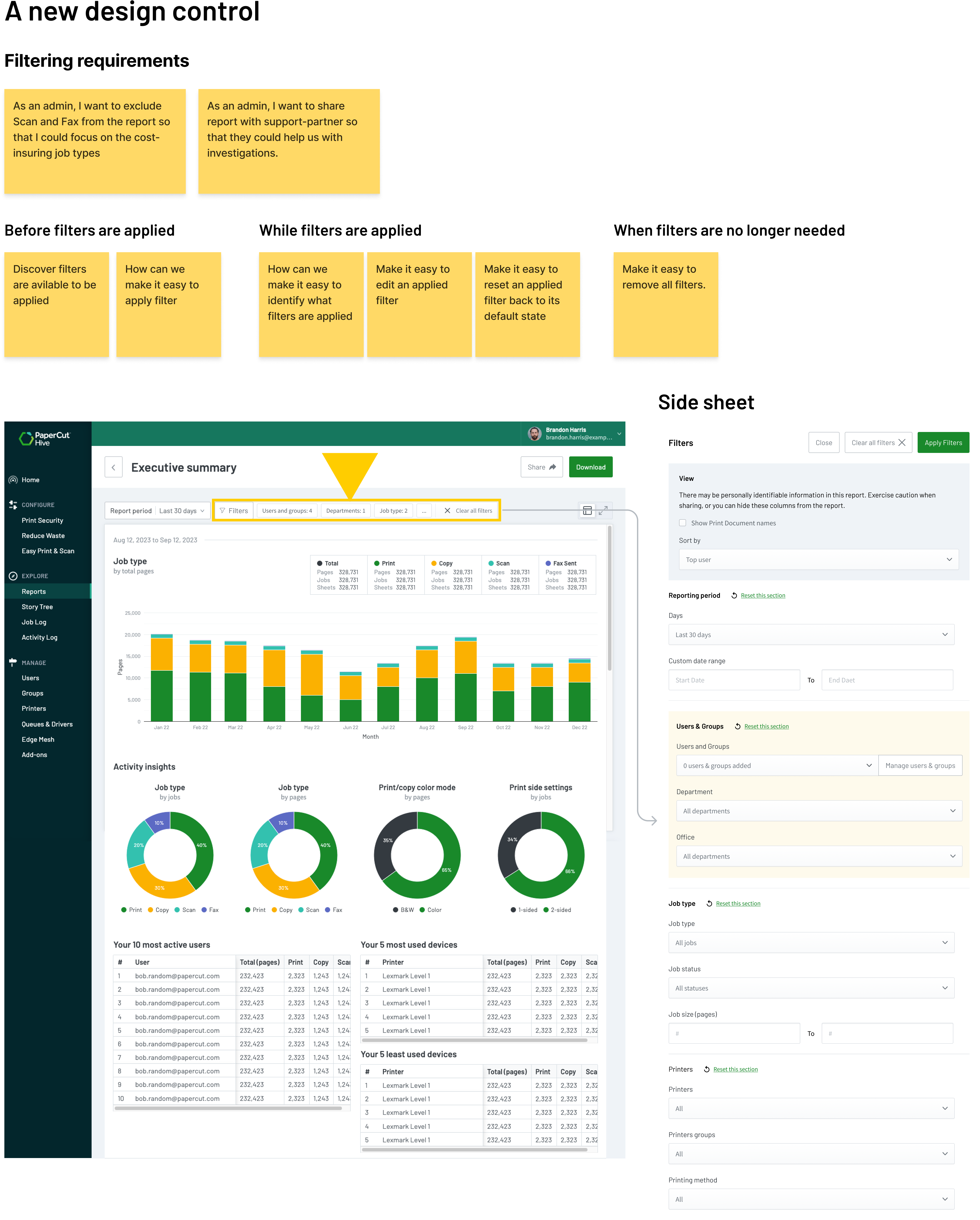
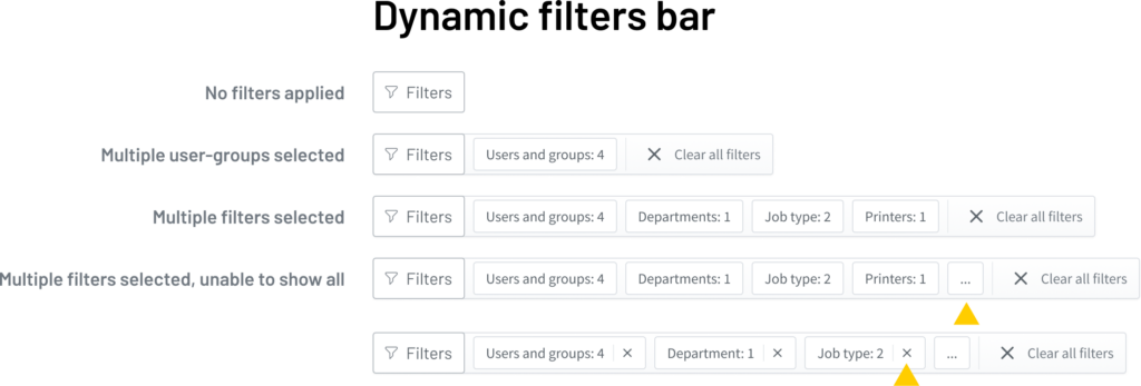
Designing an new control for DLS
The complex filter and parameter system posed a significant design challenge, offering admins extensive control over report data. To address this, I led a collaborative workshop with SMEs and fellow designers. Together, we analysed filter usage scenarios and established a scalable design pattern capable of accommodating future filter additions. Below is a key outcome of this workshop.
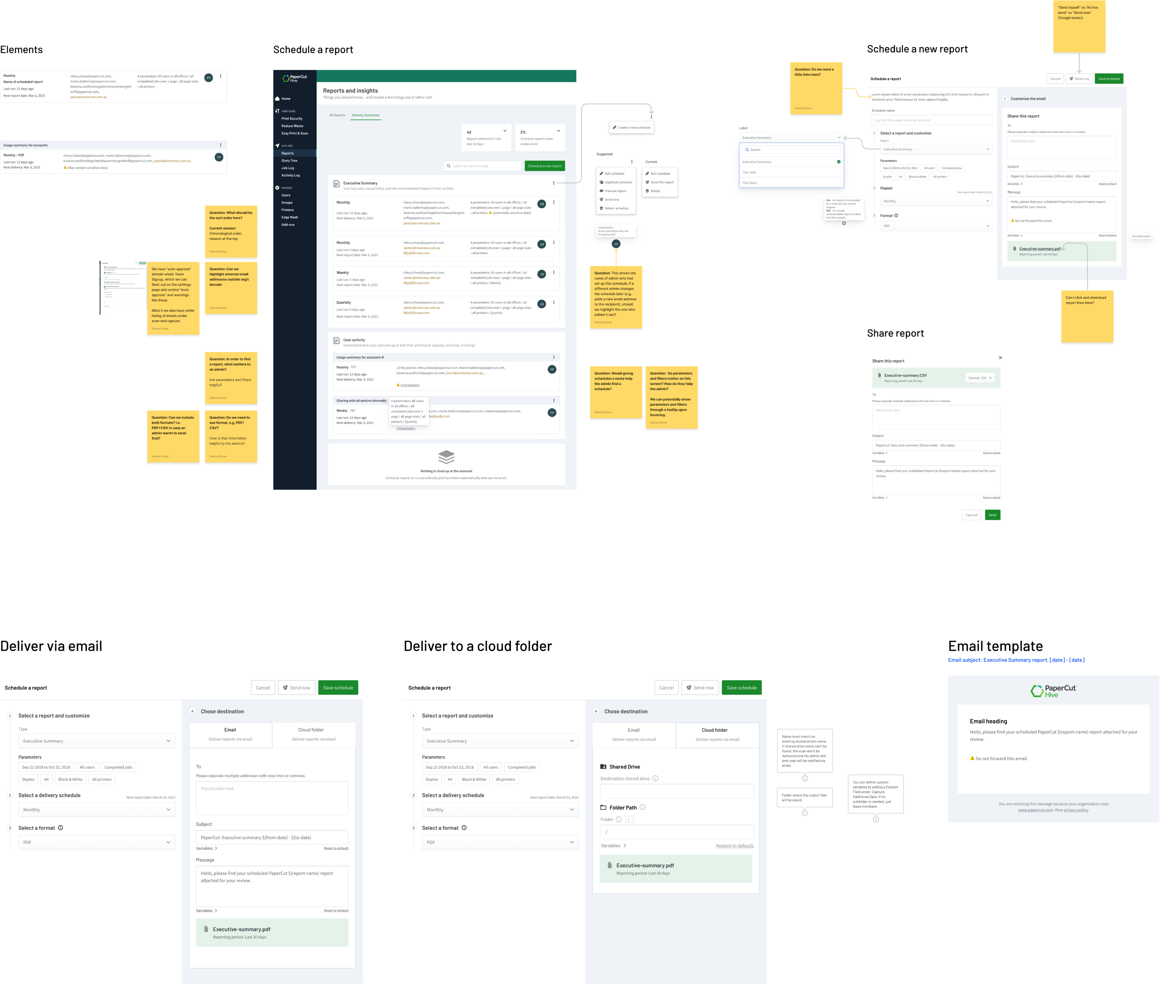
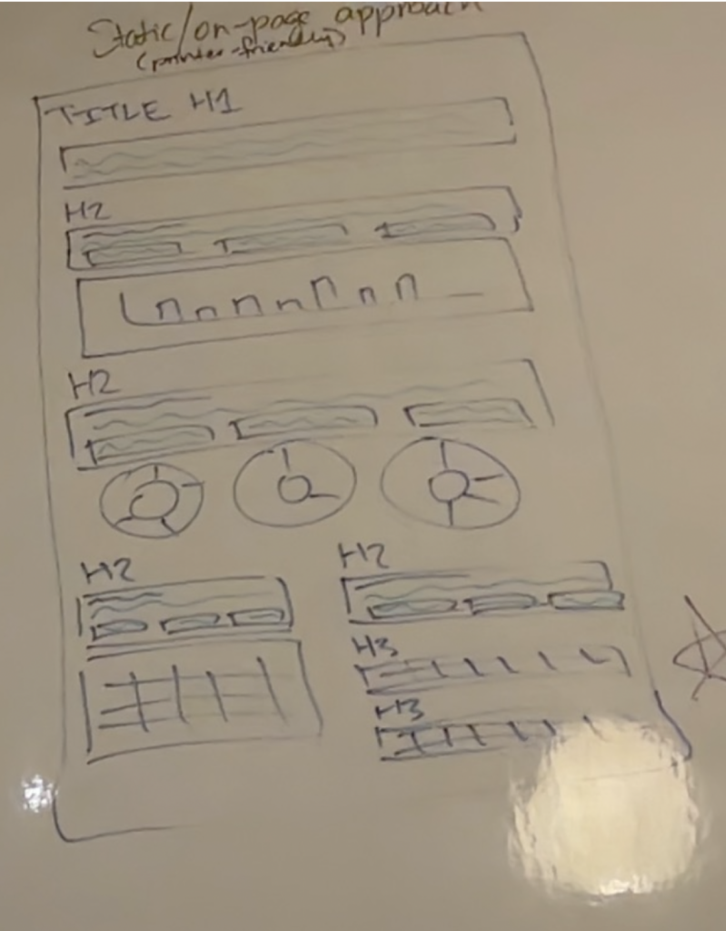
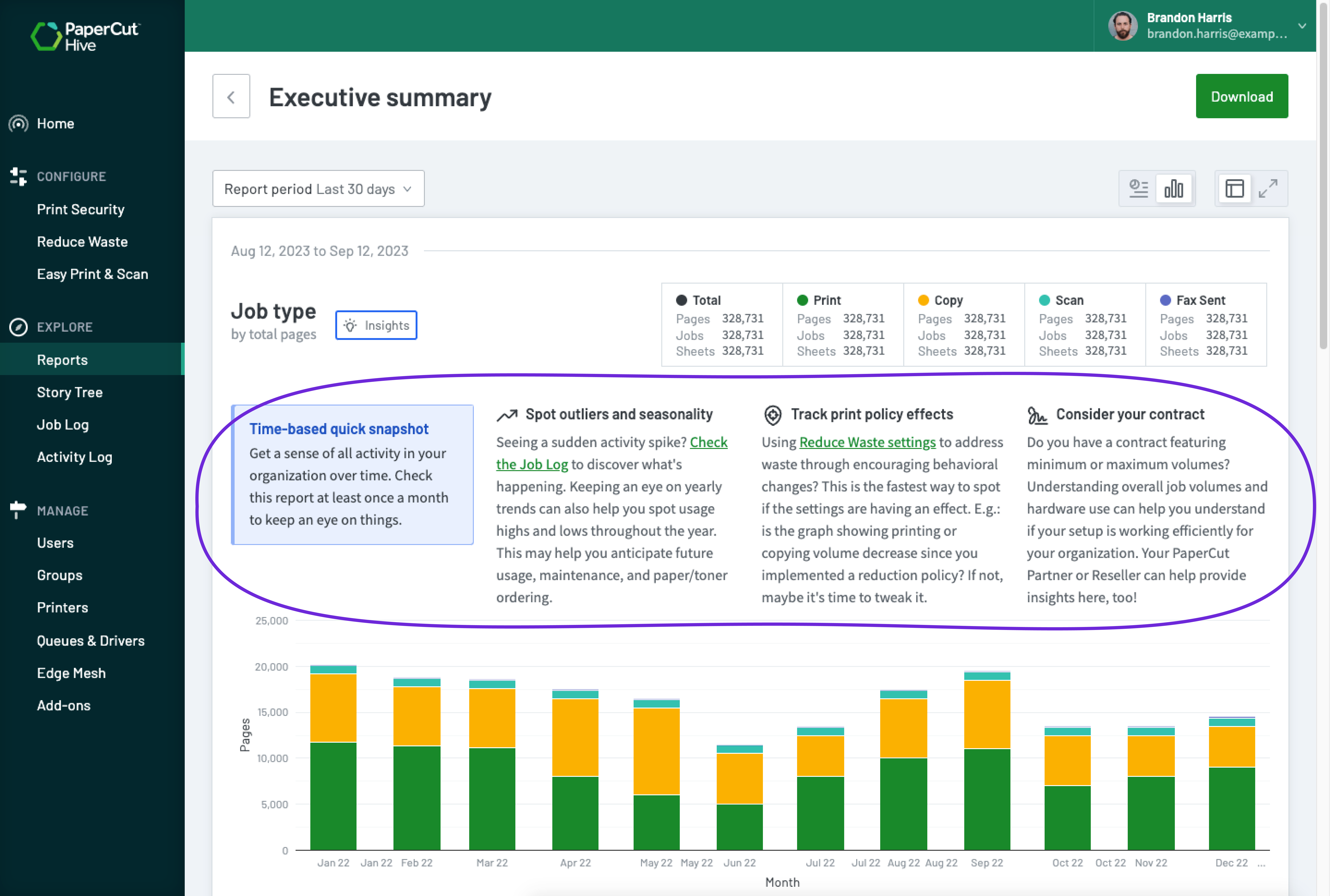
Individual reports design
Each report design went through a rigorous micro discovery, ideation, and design process to ensure that the defined tasks were completed properly and that consumers got just the essential data in an engaging and actionable format. Below is a breakdown of the steps I used to establish the content of each report.
User problem: Admins lack knowledge and expertise to interpret reports data into actionable steps.
Solution: Make reports comprehensible for the new and untrained admins
A key aspect of enhancing the user experience was the report’s ability to guide admins and empower them to act on the insights. To achieve this, I collaborated closely with an SME and content writer to create clear explanations for each report section. These explanations offered admins actionable guidance on how to leverage the data to reduce waste, enhance security, and improve ease of access within their organisation.
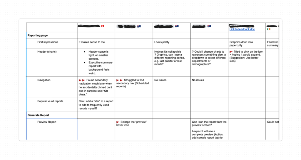
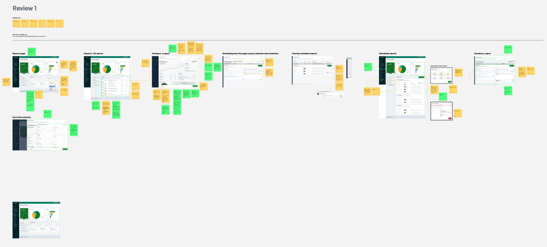
User testing on Figma prototypes
I created a clickable Figma prototype from the high-fidelity design, ensuring it was meticulously prepared for testing. After an initial copy review, the design was presented to resellers and customers for feedback.
Improving design as per user feedback
User testing highlighted several improvement areas requiring attention. I implemented a ‘3 flags’ reporting system to pinpoint minor issues and confusing designs needing resolution before moving forward.
What is working
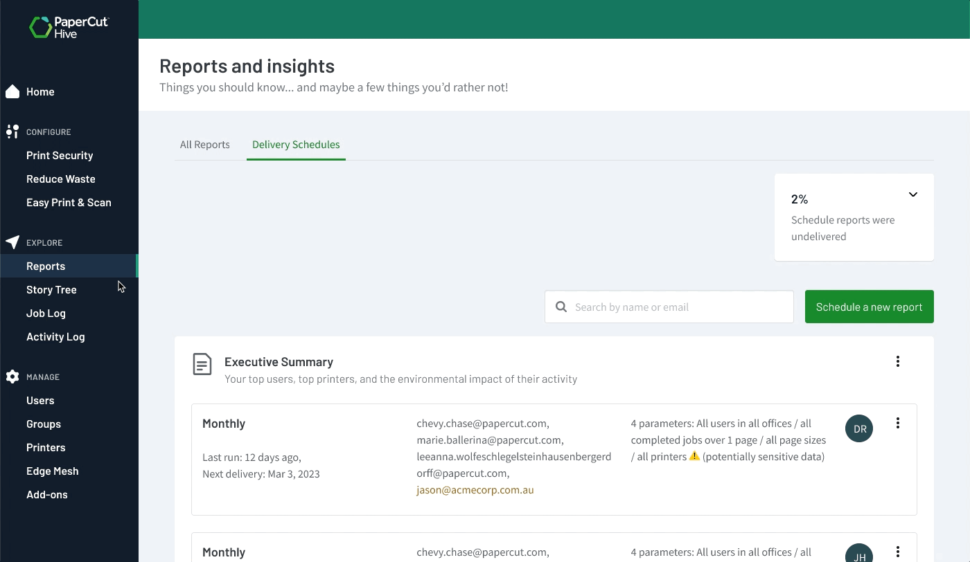
- Reports as a learning tool: To assist admins, each report preview included a summary explaining its use, becoming a valuable resource for new admins to select appropriate reports for different contexts.
- Ready-to-download reports: The summary report, highly used in the server-based platform, was well-received as a pre-generated, one-click download.
- Efficient reports generation: Users valued the pre-selected reporting periods, enabling accurate reports from the start. With just two clicks, users could select, generate, and download reports, an efficiency that garnered appreciation.
What needs to be better
- Below the fold navigation: Initial tests revealed usability issues with navigation elements placed below the fold, causing user difficulty in finding them.
- Download as PDF: Users consistently requested report downloads in PDF format, favoured for record-keeping and interdepartmental sharing, prompting its prioritisation in the next release.
- Share report via email: Noting a preference for sharing over downloading, we introduced an email sharing feature in the first release and planned future scheduling capabilities, ensuring each update meets user needs and improves experience.
User feedback on the 1st design iteration
Initial feedback from four resellers and internal SMEs was highly positive. The reports provided administrators with valuable insights, learnings, and a greater sense of control. Based on this feedback, we identified and addressed specific communication issues and visual weaknesses, significantly enhancing the reports’ clarity and usability.
User feedback on the 2nd design iteration
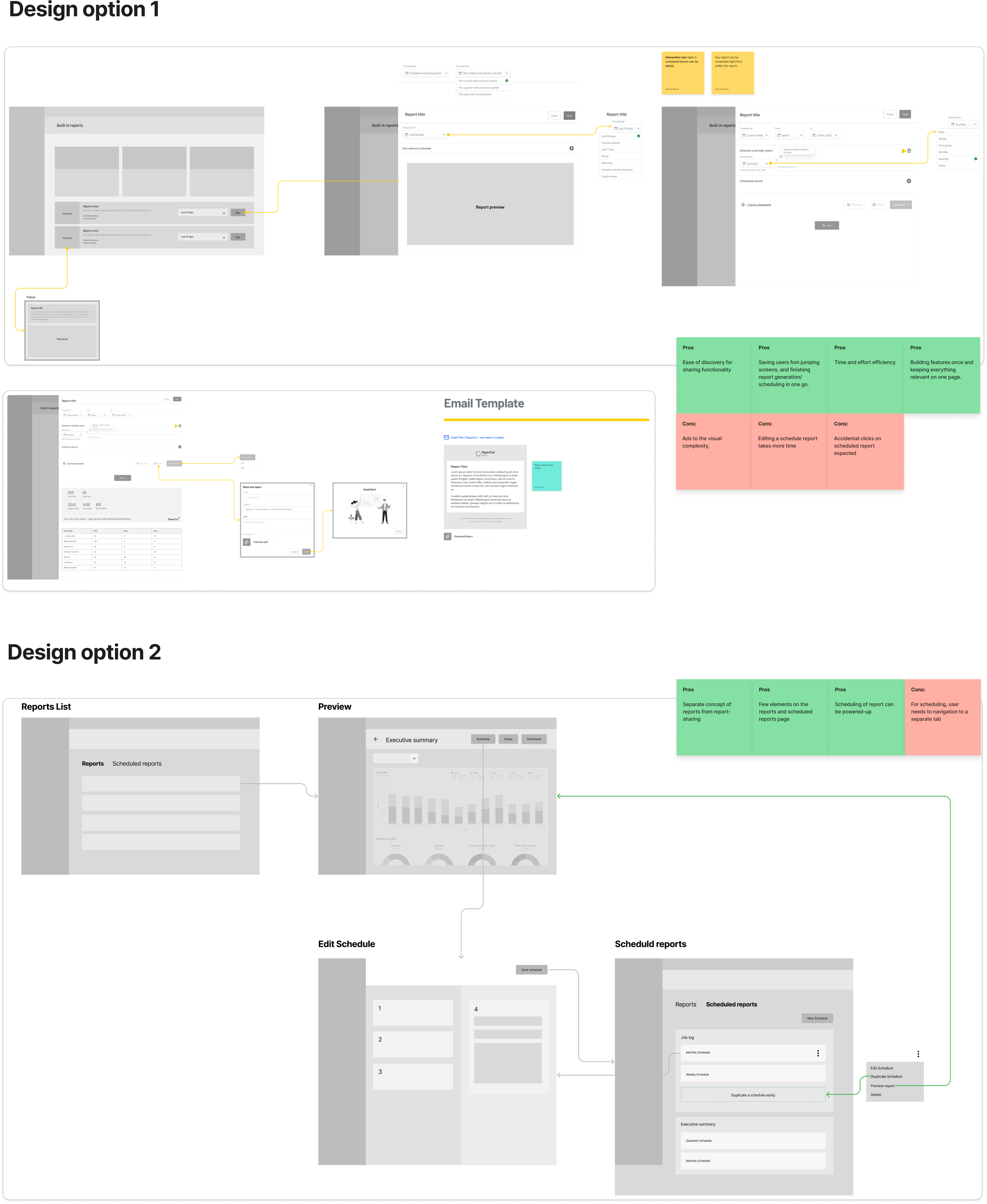
Our initial design mixed scheduled reports with the primary report list, hindering usability. Users could reschedule reports multiple times with varying parameters, creating complexity and visual clutter. This made distinguishing core report functions from scheduling details difficult. In the next iteration, I separated these sections, providing a clearer and more focused experience.
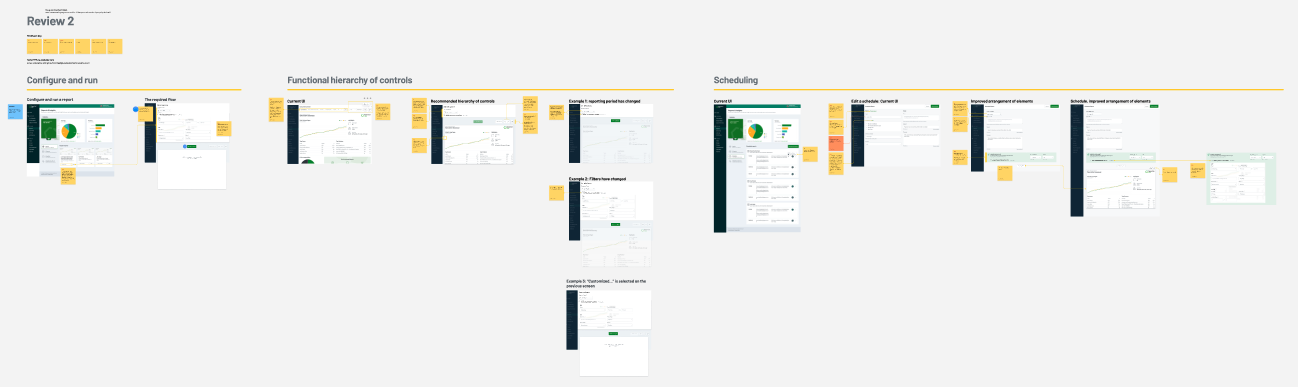
User feedback on the 3rd design iteration
Nature of third review was mostly around messaging and including message that set the user expectations around what’s coming ahead, e.g. a more powerful analysis tool and ability to share reports using a URL. with he final review in place, the team was ready to convert Figma designs into HTML prototype.
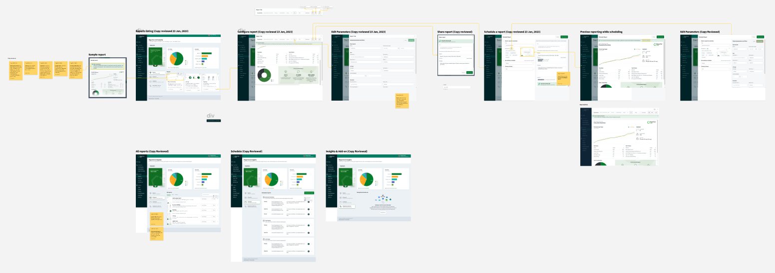
Development
After prototype testing and achieving initial product-design benchmarks, I support the developers to convert the design into HTML prototype which will become a reference and source of truth for design assets and copy.
As the product was being built, I participated in beta-testing to ensure production is as closely aligned with the design as intended and there’s no “design-leakage” in the process.
Behaviour tracking
The true assessment of a product unfolds when a group of users engages with it in an unmoderated setting. Leveraging usage Google Analytics I tracked how users were engaged with the application and areas may require further improvement.
Outcomes and success
While reports are a standard feature in print management apps, they can play a crucial role in establishing and confirming the ROI and environmental value that customers seek. The reports initiative was rolled out over several releases, starting with four basic reports and essential report generation and viewing capabilities, which were well-received. Here are some key successes of the initial offering.
Feature discovery
62% of customers interacting with it within the first 30 days validating its access and ease of use.
High user engagement
On average, customers download 2.4 reports, against a target of 2 reports each quarter.
Request for new reports
Another sign of user engagement is the growing demand for additional reports, indicating users have received benefit and are eager for more.
Thank you for going through this case study. If you would like to learn more or have a similar initiative, reach out at SalmanEhsan@gmail.com or through my LinkedIn page.