SaaS | B2B | 17 Months
Award winning social investment platform
SelfWealth, a FinTech startup established in 2012, aims to empower everyday Australians on their wealth-building journey.
As the Design Lead joining the burgeoning startup in 2015, my mission was to evolve a rudimentary proof of concept into a captivating investment experience. Over the next 17 months, I reimagined the platform by delving into user needs, trust-building factors, fears, risks, and simplifying the process of crafting and aligning with their ideal stock portfolio.

My role
- Stakeholder management
- Competitor analysis
- User research
- UX strategy
- Ideation
- Prototyping
- MVP validation & user testing
- Visual design & DLS
- Development support

Team
- Salman (Design Lead), Beau (Front-end lead), Richard (Back end lead)
Tools
- Axure RP, Balsamiq, Adobe Creative Suite
Startup vision
The startup aimed to offer a unique value proposition by granting insights into successful investors’ stock portfolios, allowing users to discover and learn from the best-performing investments.
Problem statement
In Australia, new investors often face a knowledge gap in investing, leading them to costly financial advice or underperforming portfolios. The high risk and low potential reward deter them from initiating a stock portfolio.
UX goal
Equip new stock investors with the knowledge and confidence to identify and trust industry top performers, using their portfolios as a straightforward guide for buying and selling stocks, free from complex jargon and technicalities.
Final outcome
SelfWealth emerged as a highly successful FinTech initiative becoming 3rd largest trading platform, attracting a surge of users and industry acclaim, and securing multiple awards in the FinTech sector.
Visit live application at selfwealth.com.au


How users describe it
Here’s a glimpse at user feedback regarding the product’s UX from productreview.com.au, especially from those who are new to trading. (Please note, there’s a less favourable reviews on customer support, but that’s a different issue.)


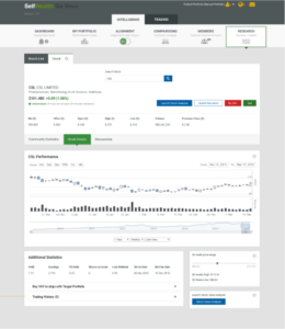
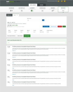
UI before I joined
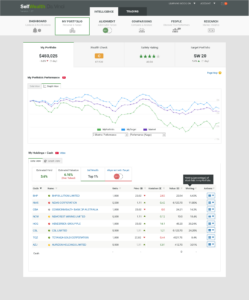
There’s a reference to a screenshot showing a bare bone portfolio creation tool the SelfWealth had at the start of their journey back in 2015
UX Strategy
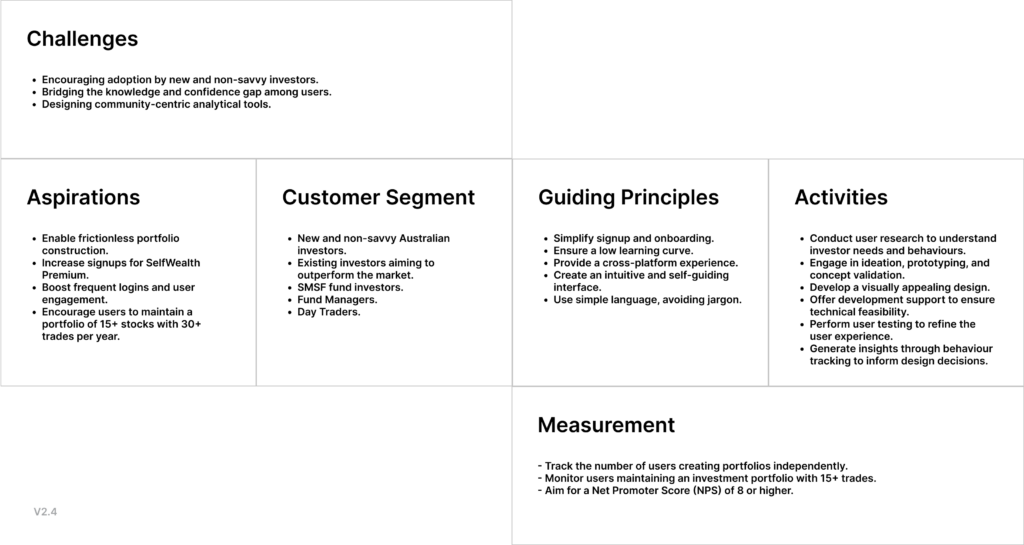
After analyzing competitors, I worked with the product lead to create a UX strategy and value proposition for SelfWealth, highlighting our strengths and giving users reasons to switch from established trading platforms.
Simplifying onboarding
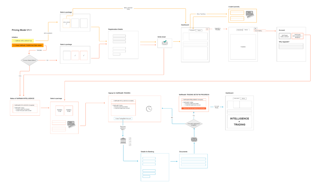
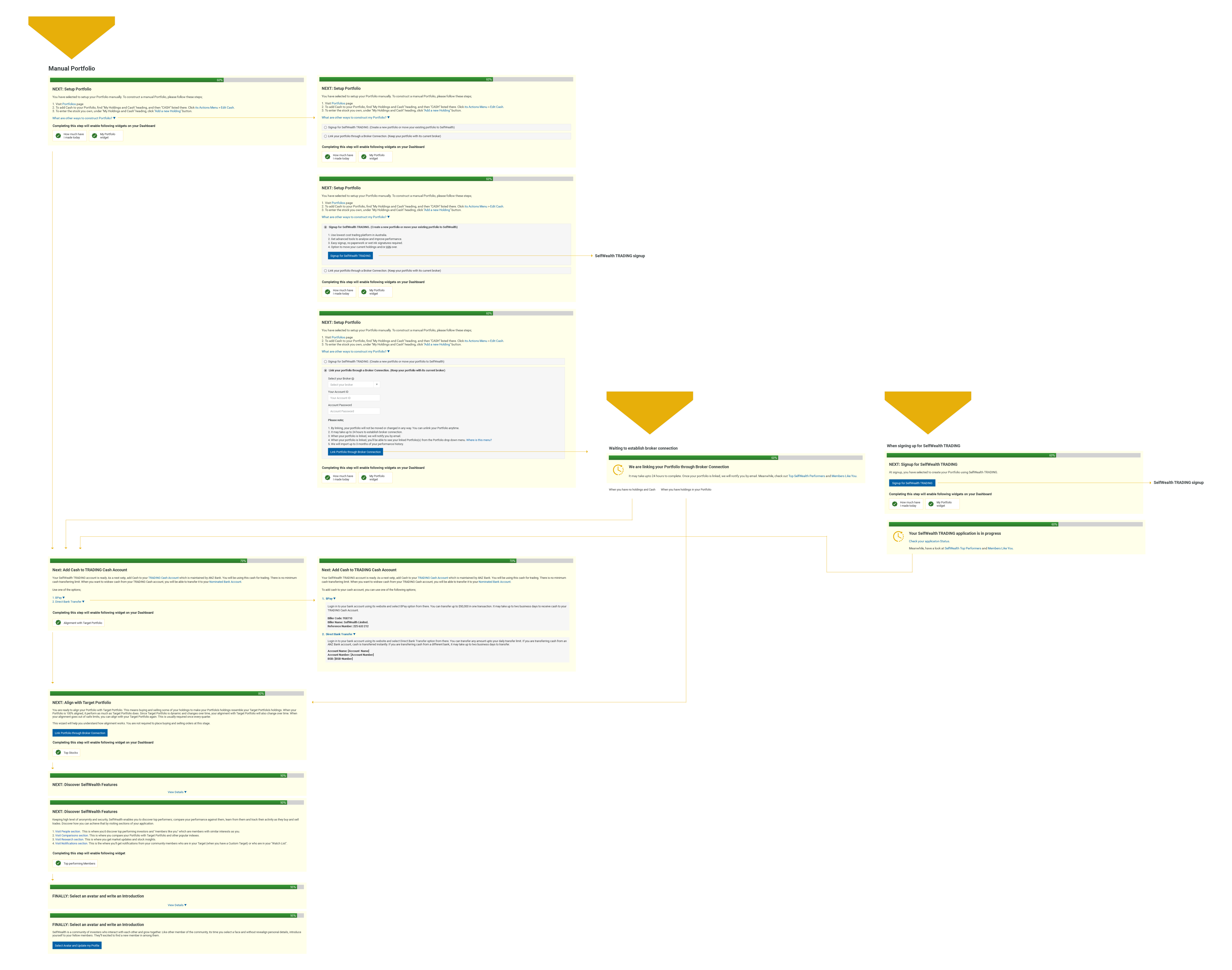
In the discovery process, I found users could take different onboarding paths based on their background and the type of trading portfolio they were handling. I mapped out all the onboarding experiences to find the quickest way to show core value to new users. Here’s a look at some of those onboarding paths.
Simplify the complex
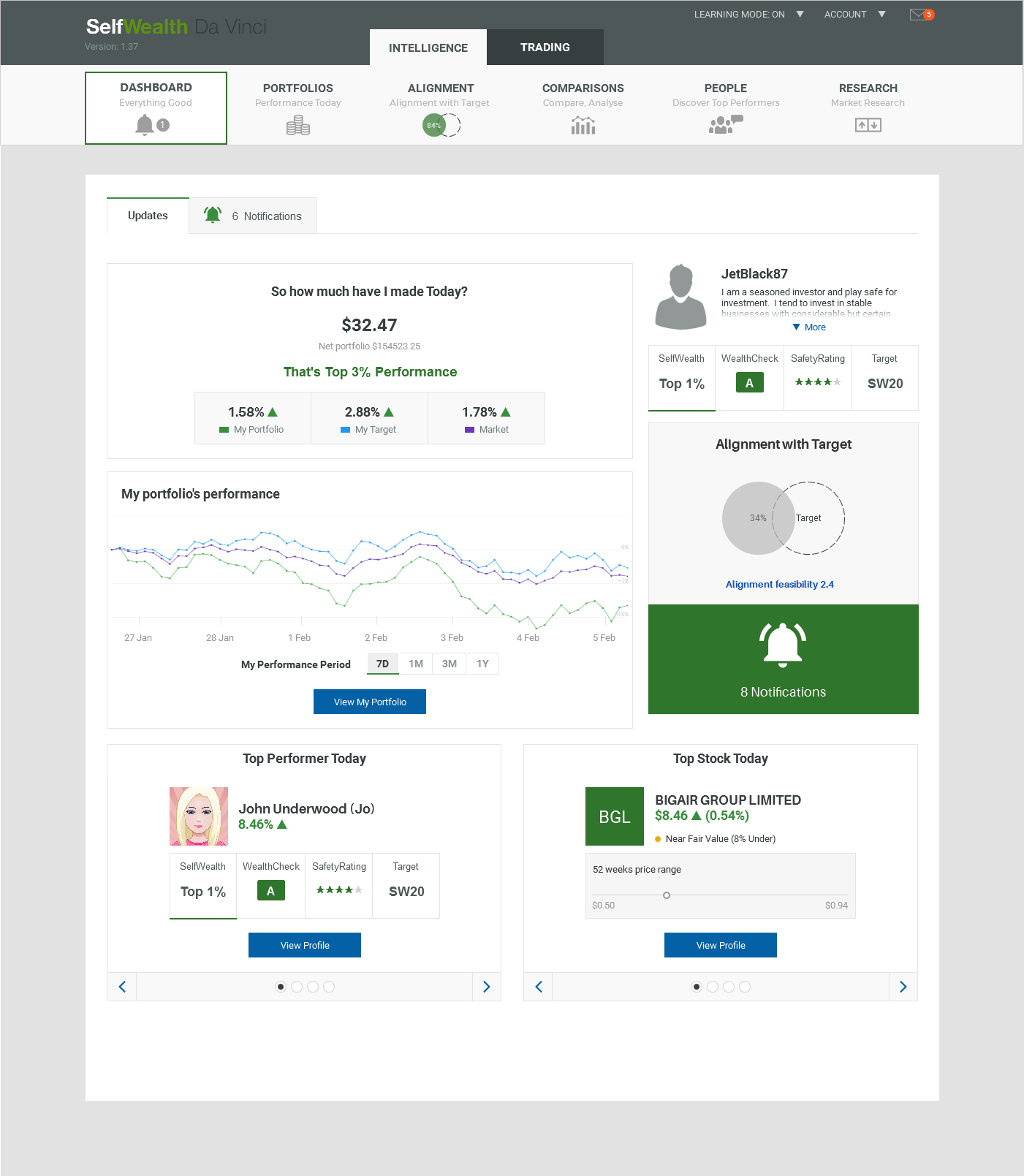
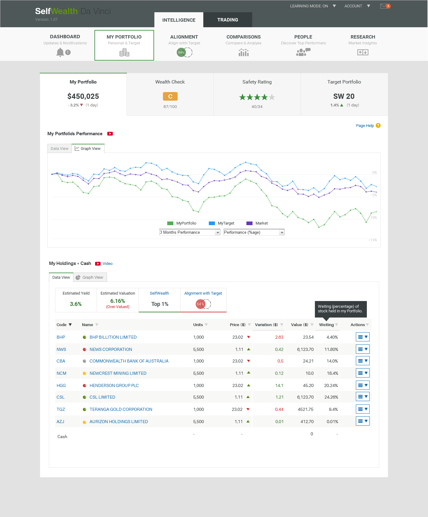
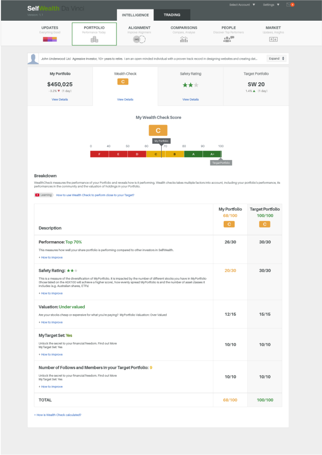
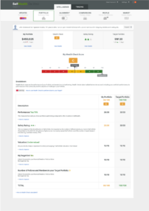
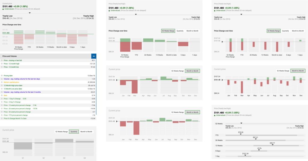
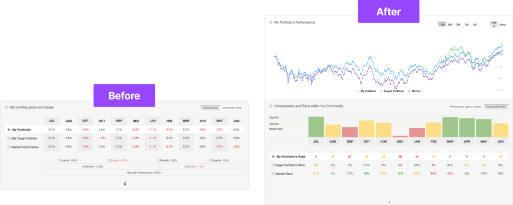
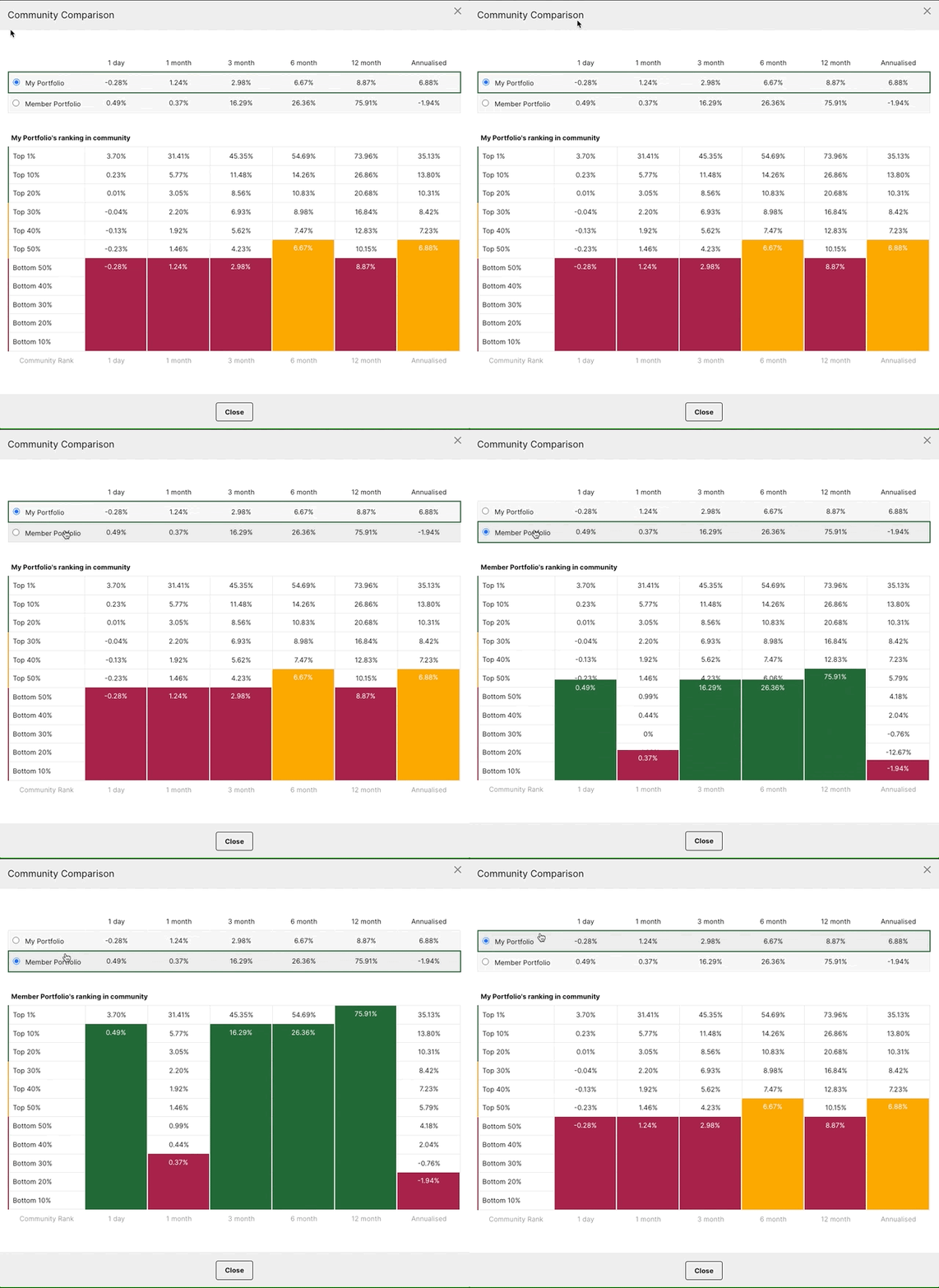
To assist the untrained mind in navigating the complexities of stock trading tools, I conducted ideation sessions to pinpoint the core tasks users aim to accomplish at each stage. My focus was on simplifying visualisation tools like graphs, charts, and trends, transforming them into straightforward, actionable insights. Below are some of the user-friendly visual tools I designed.
One-click buy & sell
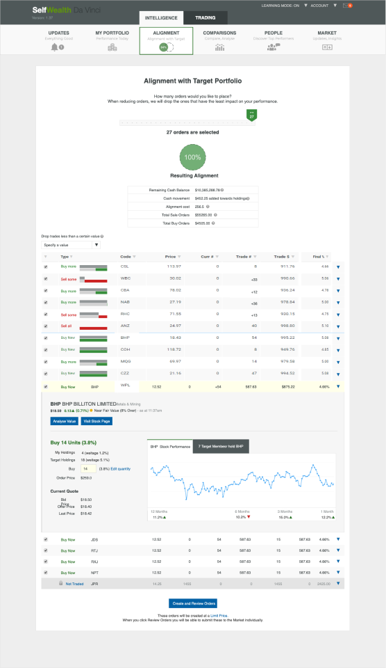
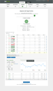
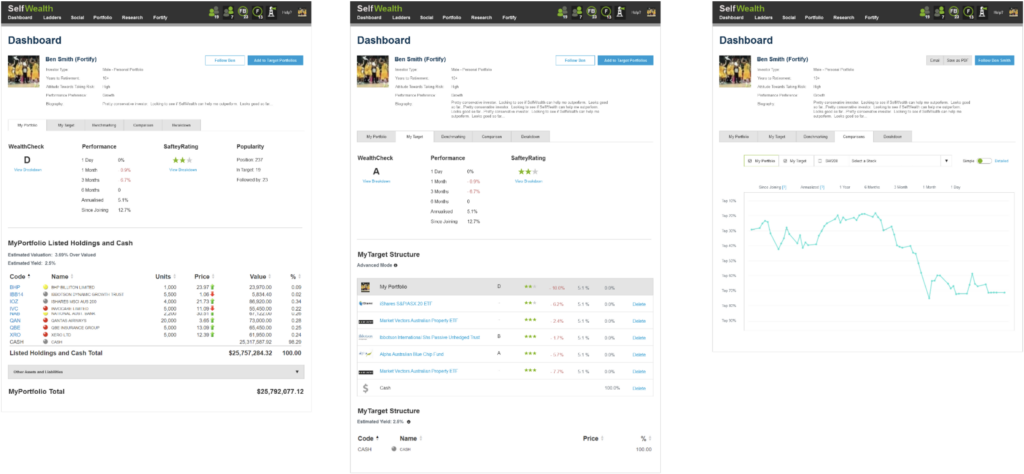
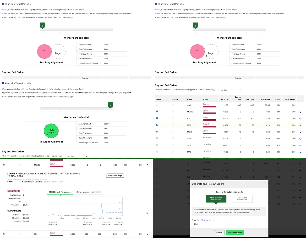
SelfWealth’s unique feature is its “target portfolio,” which allows users to create, test, and validate stocks before purchasing. To simplify portfolio alignment, I delved into understanding the decisive factors for users, which primarily revolved around the cost of alignment, or the number of trades they wish to execute on a given day. I translated this insight into a straightforward design element that has become one of the most convenient and defining aspects of the application.
Improving user engagement
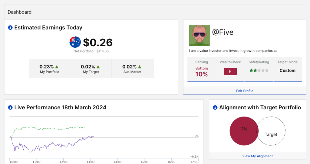
To compete with rivals and boost user engagement, we needed a feature that would encourage daily logins, despite stock portfolios typically being slow to change. I initiated customer discovery by asking, “What consistently changes and is important for investors to track in the stock market?” This led to the creation of the “Daily Earnings Tool,” an intuitive data point that investors value, inducing a desire to frequently check and stay engaged with the platform.
Elevating the value prop
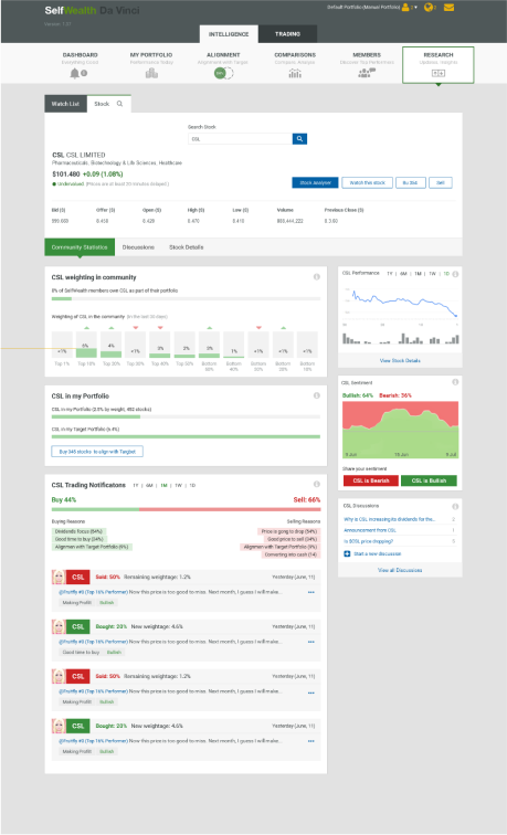
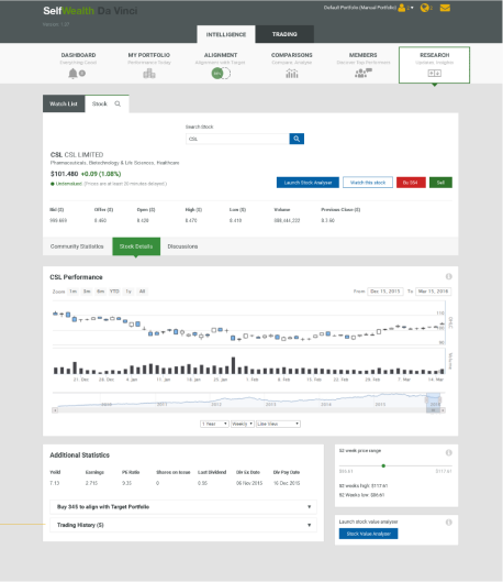
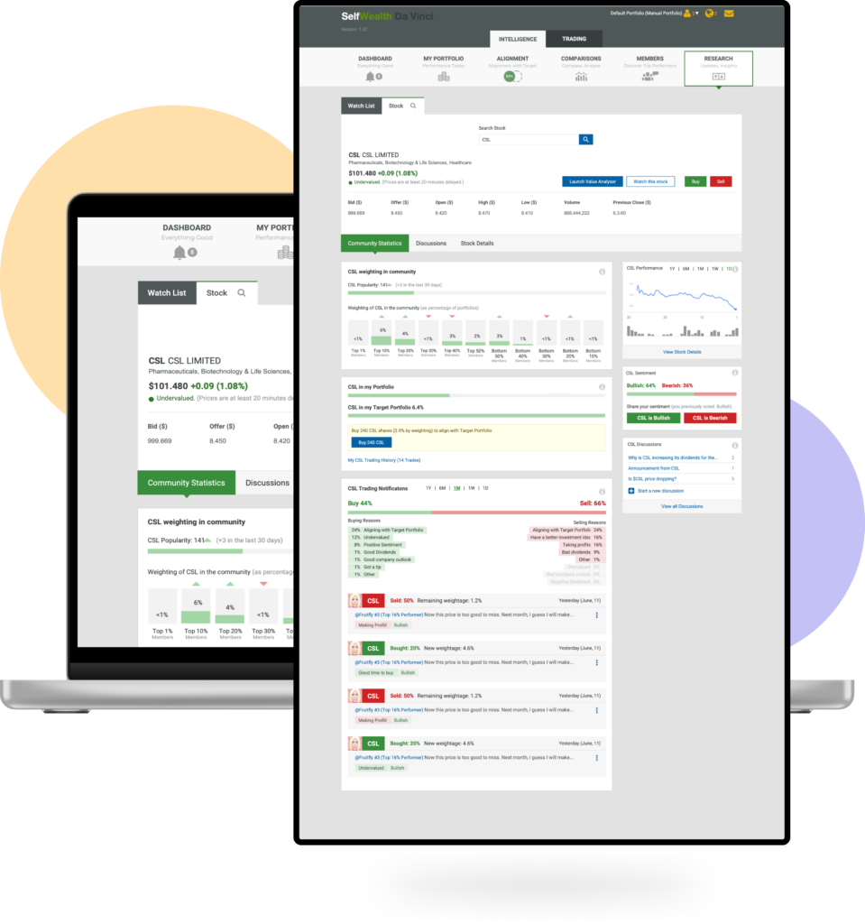
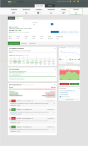
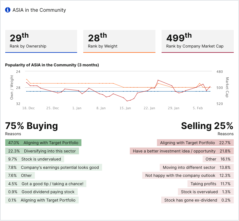
A standout feature of SelfWealth is its community-driven insights, which set it apart from market leaders. To enhance this value proposition and help users recognize its benefits, I designed distinctive visual controls that are both prominent and informative. Below is a reference screenshot showcasing one such control on the stock details page.
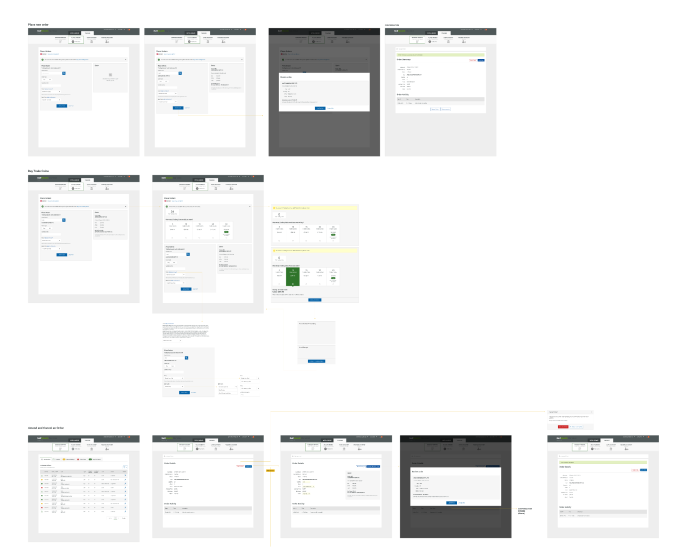
Wireframes
Here are some wireframes depicting the user flow for executing a trade in the market.
User testing
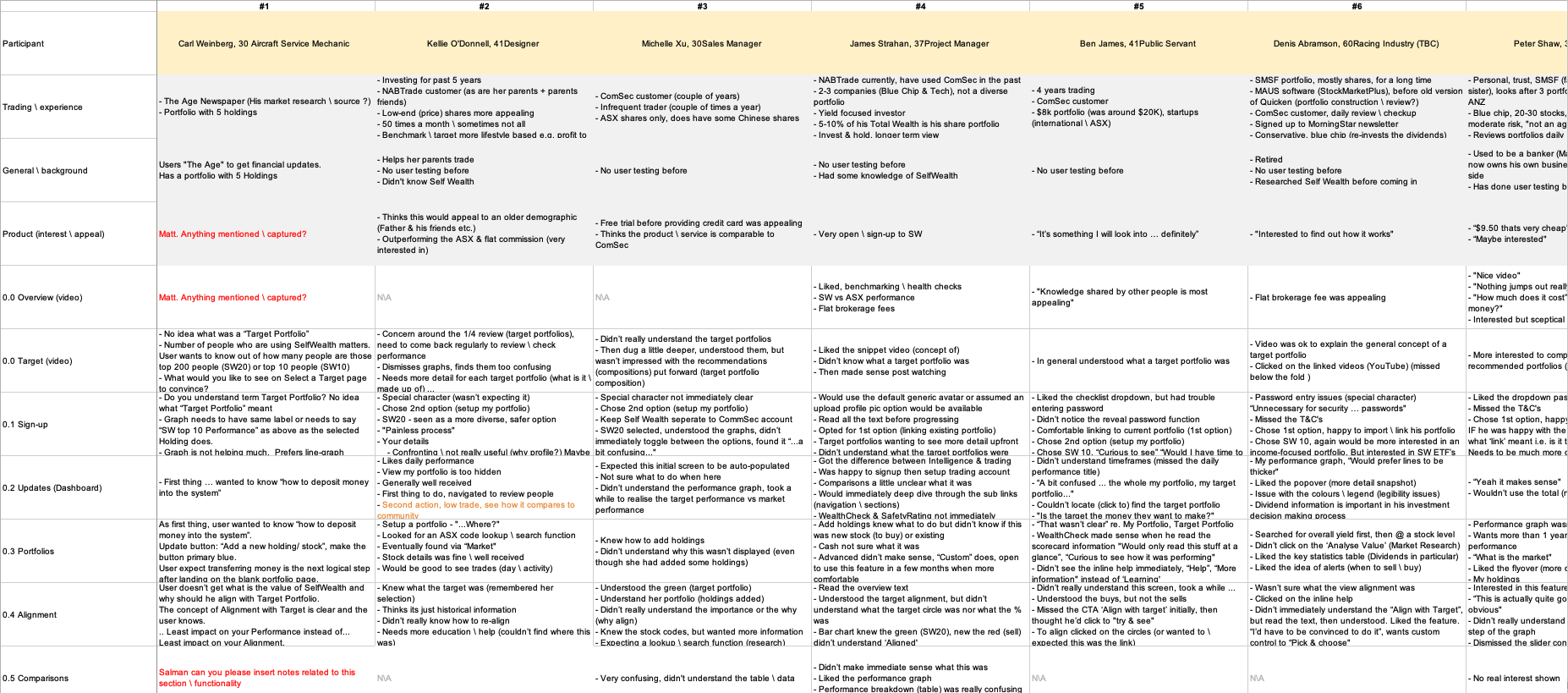
Here are some screenshots and user feedback from early user-testing, highlighting areas for improvement as we refined the value proposition and problem-solution fit over time.

Success and outcomes
SelfWealth has garnered multiple accolades for its simplicity, intuitiveness, and effectiveness in aiding newcomers to the stock market succeed without requiring years of experience. It has soared to become Australia’s third-largest stock trading platform.


