SaaS | B2C | 3 Months
Replatforming of Premiers Reading Challenge
The Premier’s Reading Challenge, a Victorian Government initiative, encourages reading in schools through competition.
As lead designer, I transformed an outdated system and designed engaging dashboards, enhancing the challenge with gamification. I joined post-specification, with a clear mandate and an 80-page brief in hand.

My role
- System Revamp: Overhauling the outdated system to meet modern standards.
- Dashboard Design: Creating custom, user-friendly dashboards for various user roles.
- Stakeholder Engagement: Collaborating with stakeholders to align design with business goals.
- Gamification Strategy: Incorporating game elements to boost user engagement and reading motivation.

Team & tools
- Draw.io, Axure RP
Organisation goals
The goal was to modernise the decade-old legacy system, elevate it to current visual and design standards, and streamline the participation process for teachers and parents in the initiative.
Product goal
Simplify the process for coordinators to launch a challenge, assist schools in opting into the initiative, enhance the overall design to be responsive, and ease school management for coordinators. Additionally, the aim was to gamify reading for children to foster a love for reading.
Design challenge!
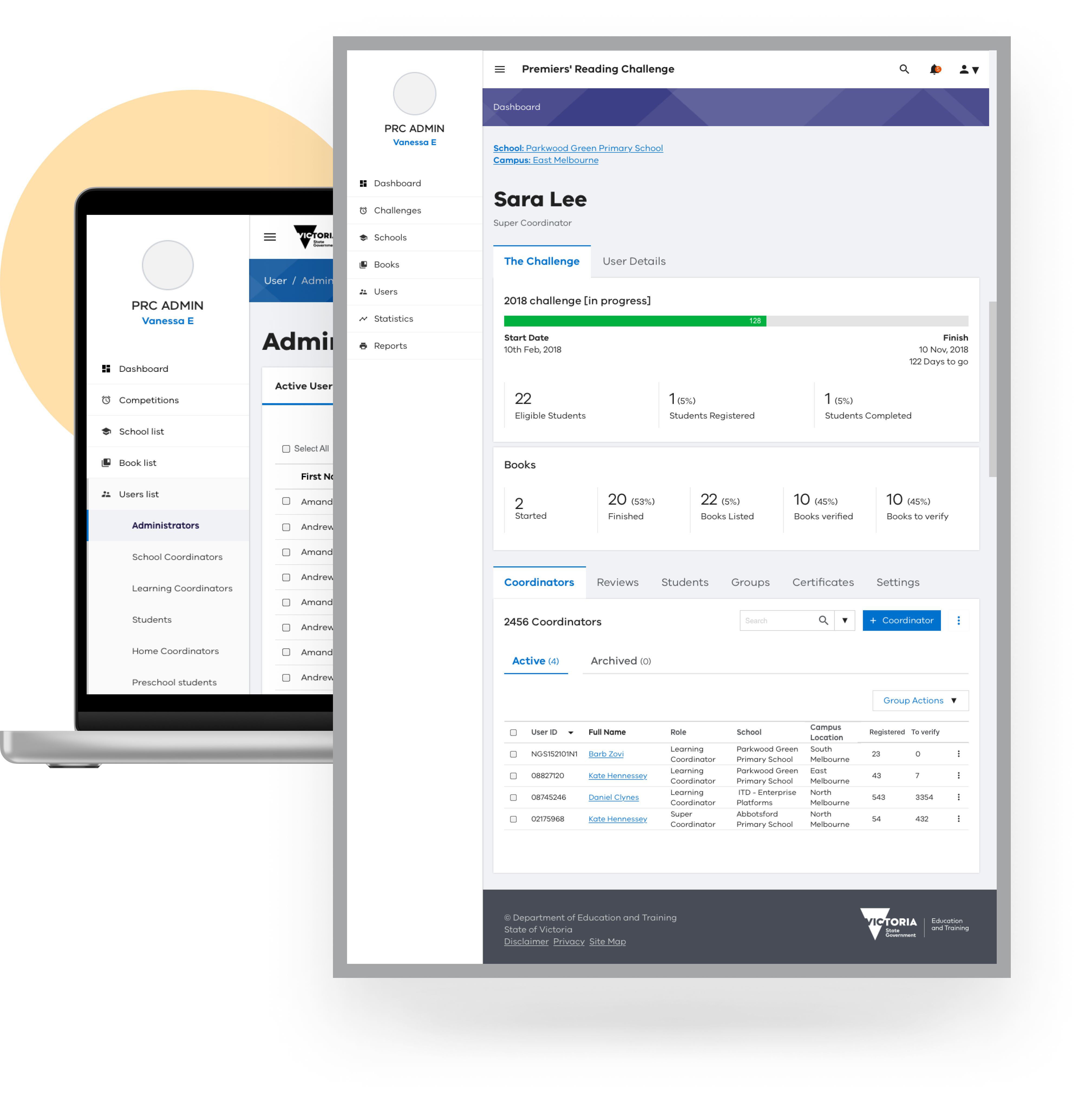
Starting from the product specifications, my responsibility involved transforming business requirements into a WCAG 2.0 compliant application design, standardizing the look and feel, and gamifying the experience for students.
Final outcome
Supporting diverse users
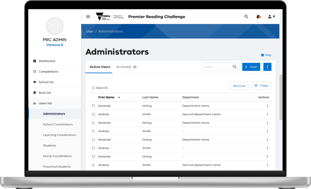
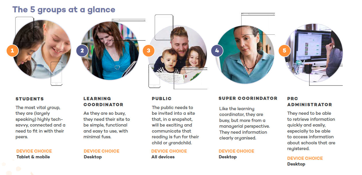
The project necessitated support for a diverse range of users, including administrators, coordinators, the public (home schools), learning coordinators, and students.
Information Architecture
The information architecture was tailored to meet the unique needs and duties associated with each user role.

Design language system
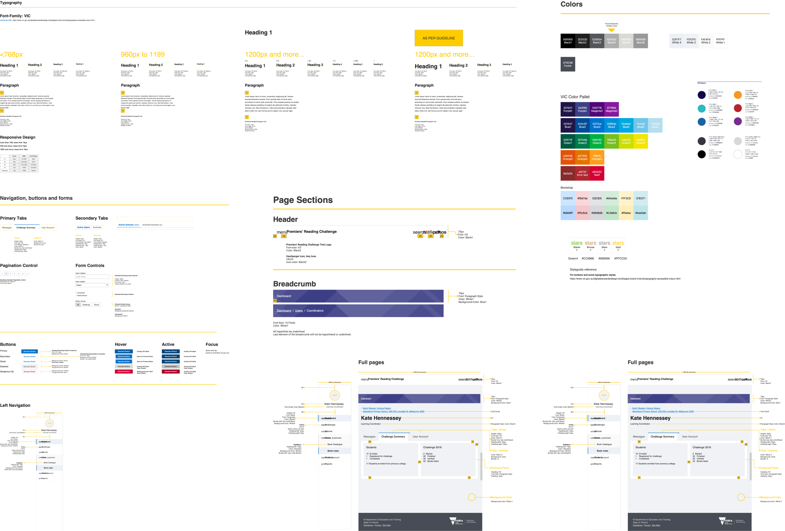
The project necessitated a WCAG 2.0 AA compliant Design Language System (DLS) compatible across diverse technology platforms. Here’s a snapshot detailing some of the elements.
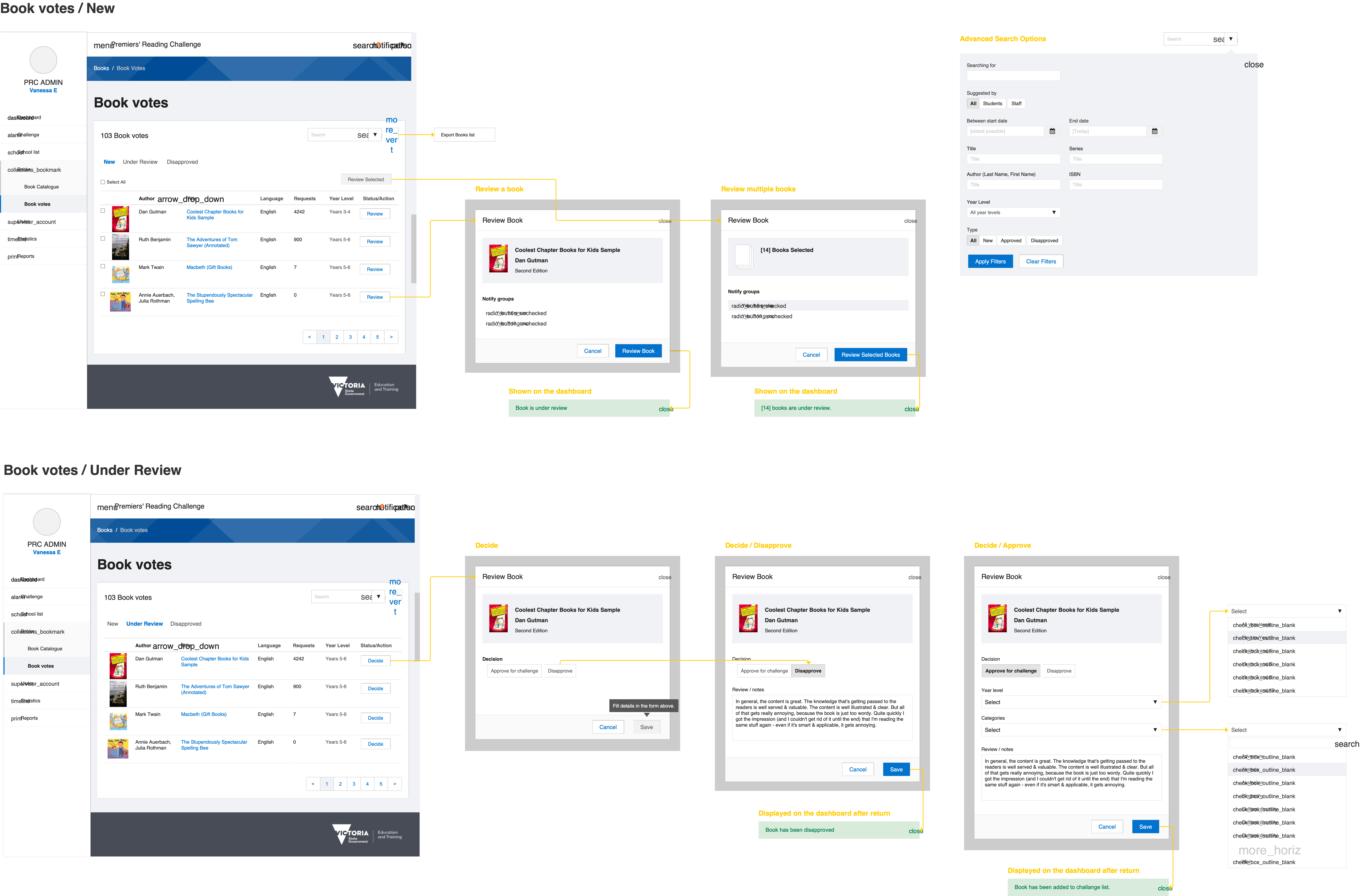
Wireframes
Design challenges
Some design challenges I tackled along the way.
Tight delivery deadlines
The project was designed to be completed within a three-month timeframe, which included the creation of user flows, the design of over 100 pages, and thorough testing to ensure quality and functionality.
Acknowledging tight time constraints, I adapted the Victorian Government Educational Department’s Digital Learning System (DLS) to meet project requirements, as shown above.
Inconsistency in specs
The team developed a detailed project spec with user stories and scenarios, despite conflicting requirements. Clarifying these through discussions with SMEs and stakeholders was challenging but essential for consensus.
I led targeted validation sessions with stakeholders, scrutinizing requirements to pinpoint gaps or overlaps. This early clarity cut down the design review sessions needed, streamlining our workflow.
Resuming userflows
To optimize development efficiency, we needed to create flexible design components for reuse with minimal adjustments for other users.
To maximize code reuse, I concurrently designed user interfaces and flows for all user types, ensuring both common and unique requirements were met with a single UI accommodating all needs.
Testing with Students
I lacked direct access to students, so their portion of user testing was conducted through representatives and teachers.
I created quick user testing guidelines enabling teachers to conduct user testing with kids, record feedback on the screens themselves, and share findings to help improve the design.
Outcomes and success
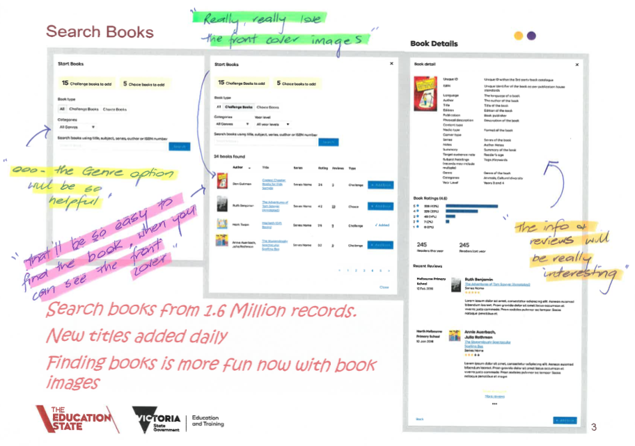
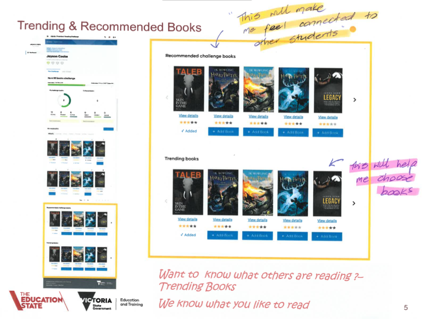
User testing with both teachers and students revealed an overwhelming enthusiasm for the new application, emphasizing its ability to offer simplicity, control, and ease in comparing progress with other students and classes within the school.
