SaaS | B2B | 6 Months
Cloud-linked printer app for scanning
Scan to cloud ability was key for the business to establish value differential in the marketThe project entailed delivering scan-to-cloud capabilities through printer apps, a mobile app, and a configuration section for the administrators via cloud-based admin console.

My role
- UX strategy
- Research & discovery
- Competitive analysis
- Ideation and design
- Wire-framing and prototyping
- Design validation with partners and customers.

Team
- Salman (Design Lead), Ricardo (Product Lead), Shalini and Greg (Dev Leads in separate phases)

Tools
- Miro, Figma and Draw.io
Business goals
- Make premium subscription more lucrative for baseline subscribers.
- Achieve a competitive edge in the market.
Product goal
- Ensure that the scan-to-cloud feature is more user-friendly and reliable than the native scan-to-email app.
UX goals
- Design a creative, intuitive admin console that untrained users could use 99% of the time without needing assistance.
- Creating a distinctive value proposition through a superior look and feel.
- Streamlining, enable customers to scan in just three clicks.
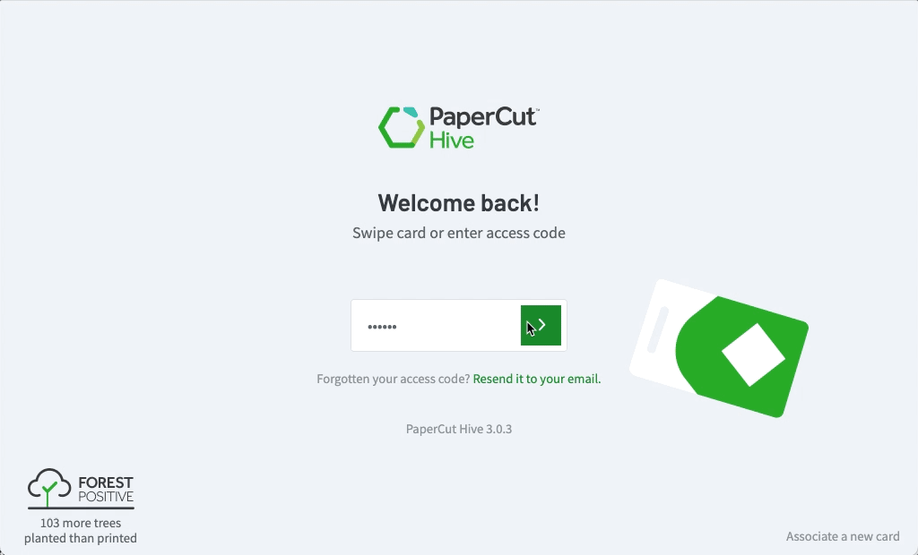
The printer app
Here is a preview of HTML prototype demonstrating “one-click-scan” and “settings”.
Design Challenges
Understanding Baseline Expectations
To exceed user expectations, we needed to first evaluate the existing average experience and uncover what actually delighted consumers.
How I solved it: I carried out a series of interviews with customers and partners and request them to record how they scan to pinpoint basic expectations and elements of delight. These insights led us to realise that a “one-click-scan” would offer unparalleled convenience and excitement for users.
Varying device capabilities
Our challenge was to design a universally compatible app for printers with diverse tech specs, screen sizes, and touch sensitivities. The aim was a seamless app across all devices.
How I solved it: I solved it by not just creating a basic app for the least capable device but by designing two versions: a feature-rich, user-friendly one, and a simpler one for less capable devices, ensuring core consistency. This strategy succeeded, especially as older devices became obsolete.
Maximising efficiency
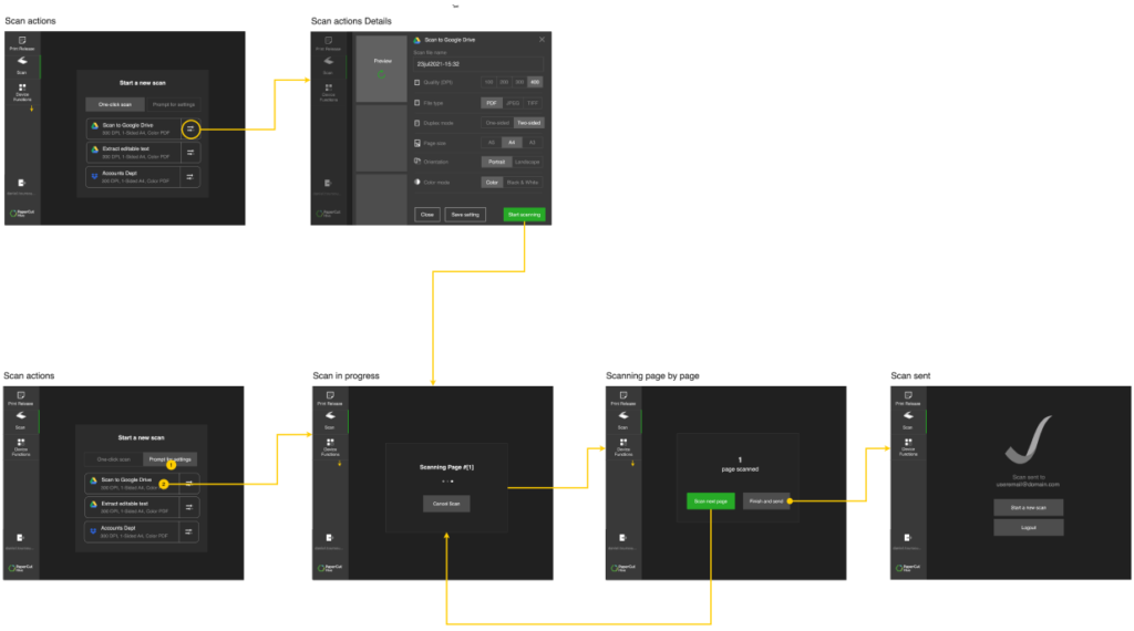
A UX objective was to enable users to finish a scan in just three clicks, despite the complexity of multiple scan destinations and various tasks like single/multiple-page scans, setting adjustments, orientation, OCR, and resolution changes.
How I solved it: I facilitated brainstorming sessions aimed at minimalism, leading to the “one-click-scan” concept: choose a cloud destination and scan with a single button press, achieving unparalleled market simplicity.
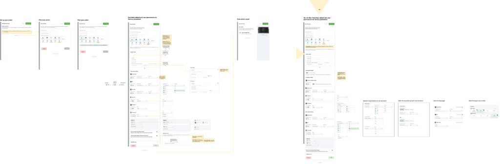
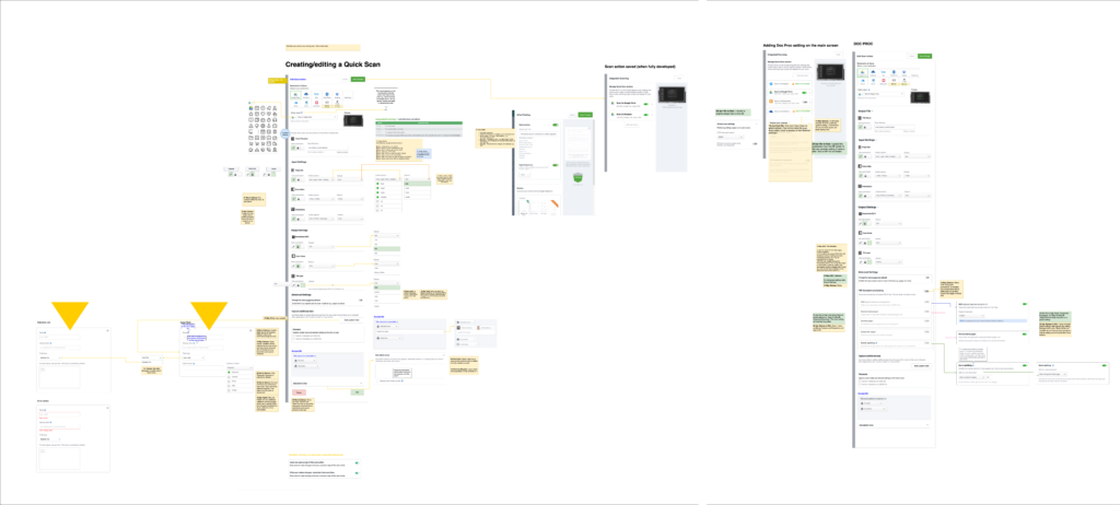
Admin userflows
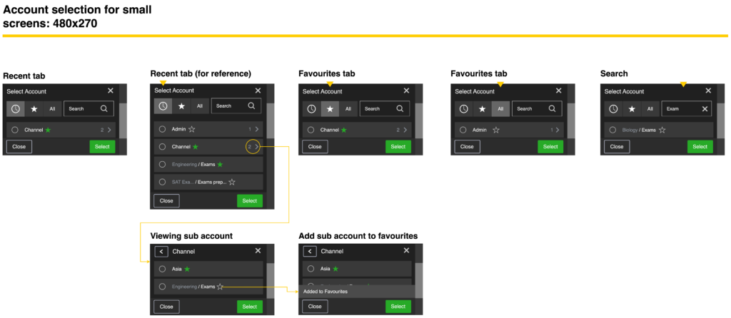
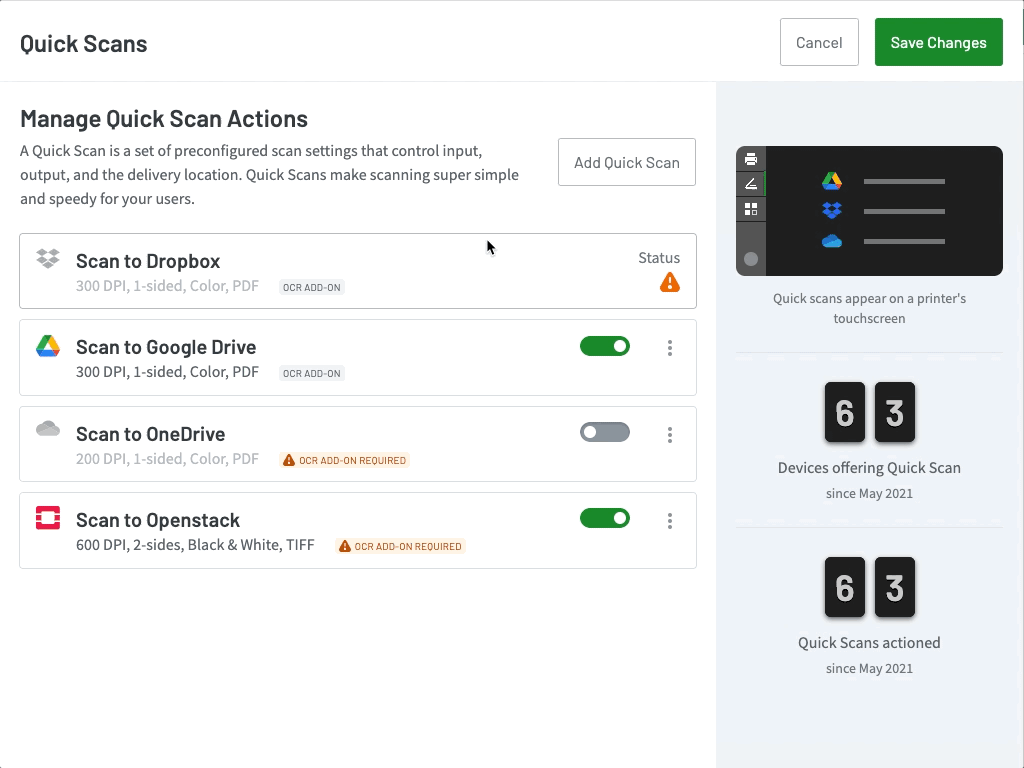
The admin console
Here is a preview of the admin console, enabling administrators to publish scan functionality and control the content displayed on the scanning app. This represented one of the most substantial tasks, requiring several rounds of ideation, design, testing and review due to the technical constraints associated with every aspect.
Design challenges
Technical complexity
With a vast array of options available in the online admin console, a major challenge was logically organising visual elements to create a design that was both learnable and efficient.
How I solved it: I delved into extensive ideation and wire-framing exercise spanned over months to continuously simplify, improve and organise information and continuously testing with partners and customers to validate designs.
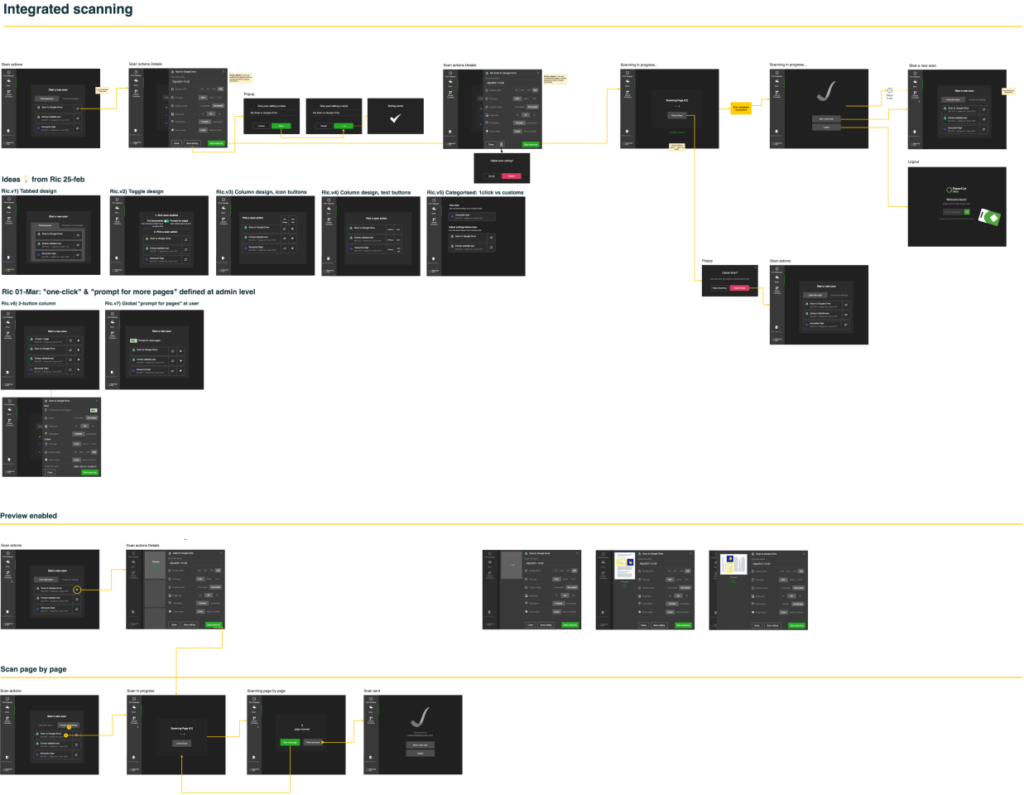
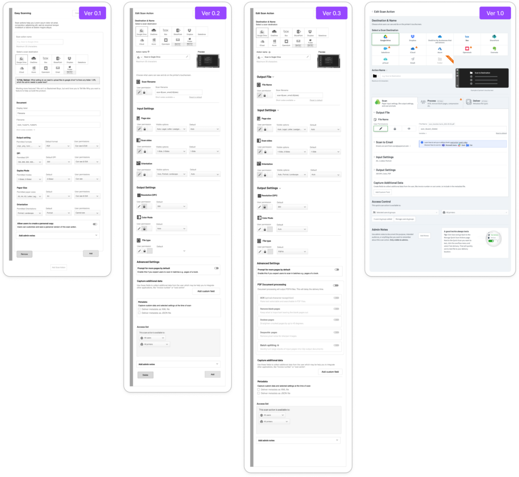
Iterative improvements
The component was highly technical and required validation for technical feasibility and compatibility with the supported devices. Here’s a glimpse of how I initiated the process, building it to be robust and enhancing the UX with each subsequent iteration.
Userflows
Outcomes and success
This was a crucial value driver for premium subscriptions, and the success of this component contributes to the overall success of the business. Here are some aspects to evaluate.
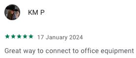
Some reviews on Google Play


High uptake
80+ of customers using premium subscription are benefitting from it.
Simpler, faster, better
The scan app is faster than native apps saving users time and effort, and hence becoming the first choice to do scan jobs.
Low support requests
A high uptake results in an influx of support requests but we’re excited to find seamless adoption with minimal need for support.