![]()
Case Study – SaaS Product Design
Reporting Engine For Print Environment
In any enterprise product, reports aren’t just an add-on. They’re the proof of value. In print management, they serve as confirmation that cost savings, waste reduction, and security controls are actually working. Without them, admins are flying blind and stakeholders are left wondering what exactly they’re paying for.
We knew we needed to go beyond basic logs. We needed to build an insights engine that helped admins see the story behind the data and act on it.
#
My role
Discovery – 4 weeks
Ideation & Design – 6 weeks
Prototyping & User Testing – 6 weeks (Figma + HTML)
#
The Team
Team – Design Lead (myself), Product Lead (Keith), Dev Lead (Shalini), 6 Developers, Front-end (Mat W)
The Goal
The primary goal of this project was to develop a robust reporting engine that simplifies data analysis in a print environment, enabling admins to make informed decisions quickly and efficiently.
The Challenge
The existing product tracked everything, but surfacing anything meaningful was a job in itself. Admins were stuck parsing raw CSVs. Security breaches, waste spikes, usage trends buried.
Our Starting Hypothesis
We began with a simple idea: if we could make print reports easy and insightful, then everyday admins could find cost savings and security improvements on their own. This hypothesis kicked off our research and shaped the questions we asked from day one.
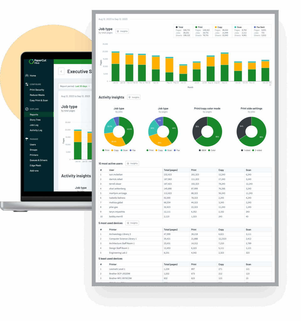
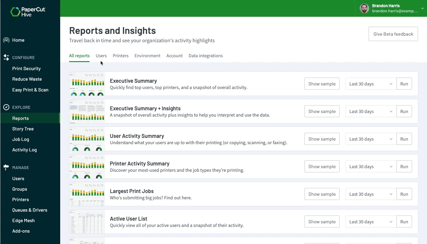
The End result
The Reporting Engine
Before Reports
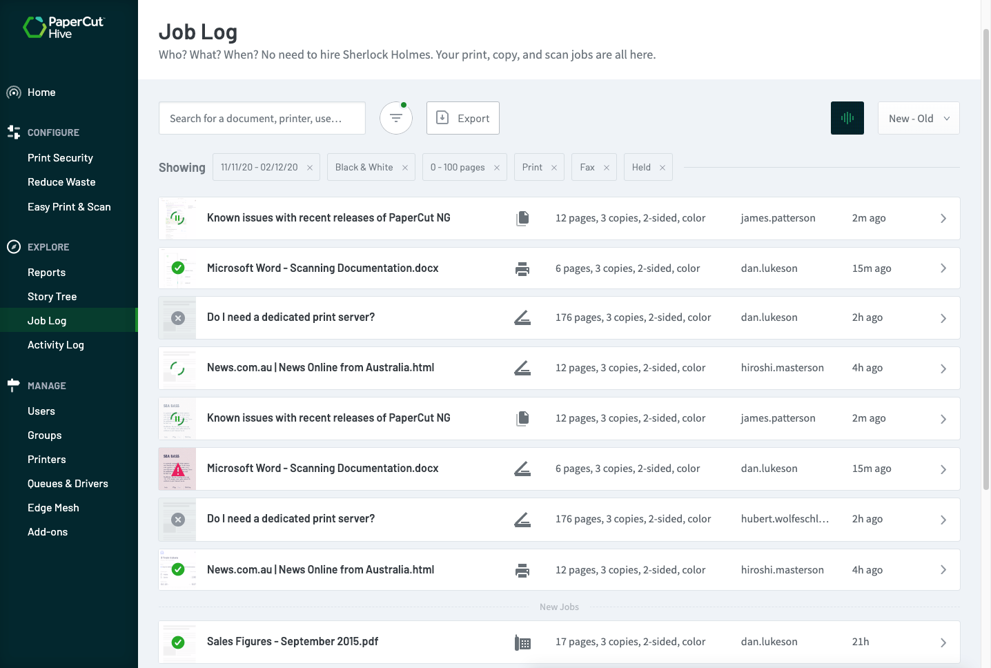
The Starting Point
Before we introduced the new reporting engine, admins relied on a basic job log page. It showed raw data but offered no real insights.
Identified problems:
- Limited Insight from Job Log: It documented events without providing deeper insights, making it challenging to analyze trends during investigations.
- Difficulty in Data Analysis: Admins lacked the expertise to analyze CSV, resulting in less actionable insights.
- Inability to Detect Resource Misuse: Job log couldn’t identify misuse or underutilization of printer resources, leading to inefficiencies and costs.
- Challenges for Resellers: Without detailed reporting, resellers found it difficult to demonstrate value to potential customers.
Strategic Context
At the outset, we knew the reporting engine wasn’t just another feature, it was a strategic necessity to stay competitive. Our competitors already had strong reporting, so we had to align this new component with our existing product and market demands. We focused on usability, data visualization, and seamless integration to ensure the reporting engine not only met but elevated our product’s strategic goals.
Understanding users we’re serving
Discovery Phase
Understanding What Users Were Really Trying to Do
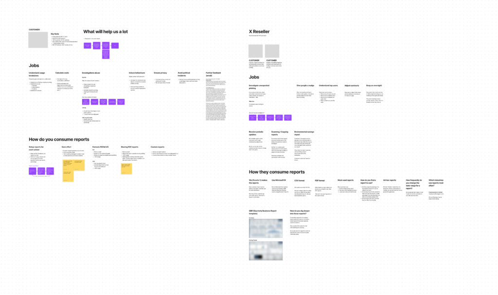
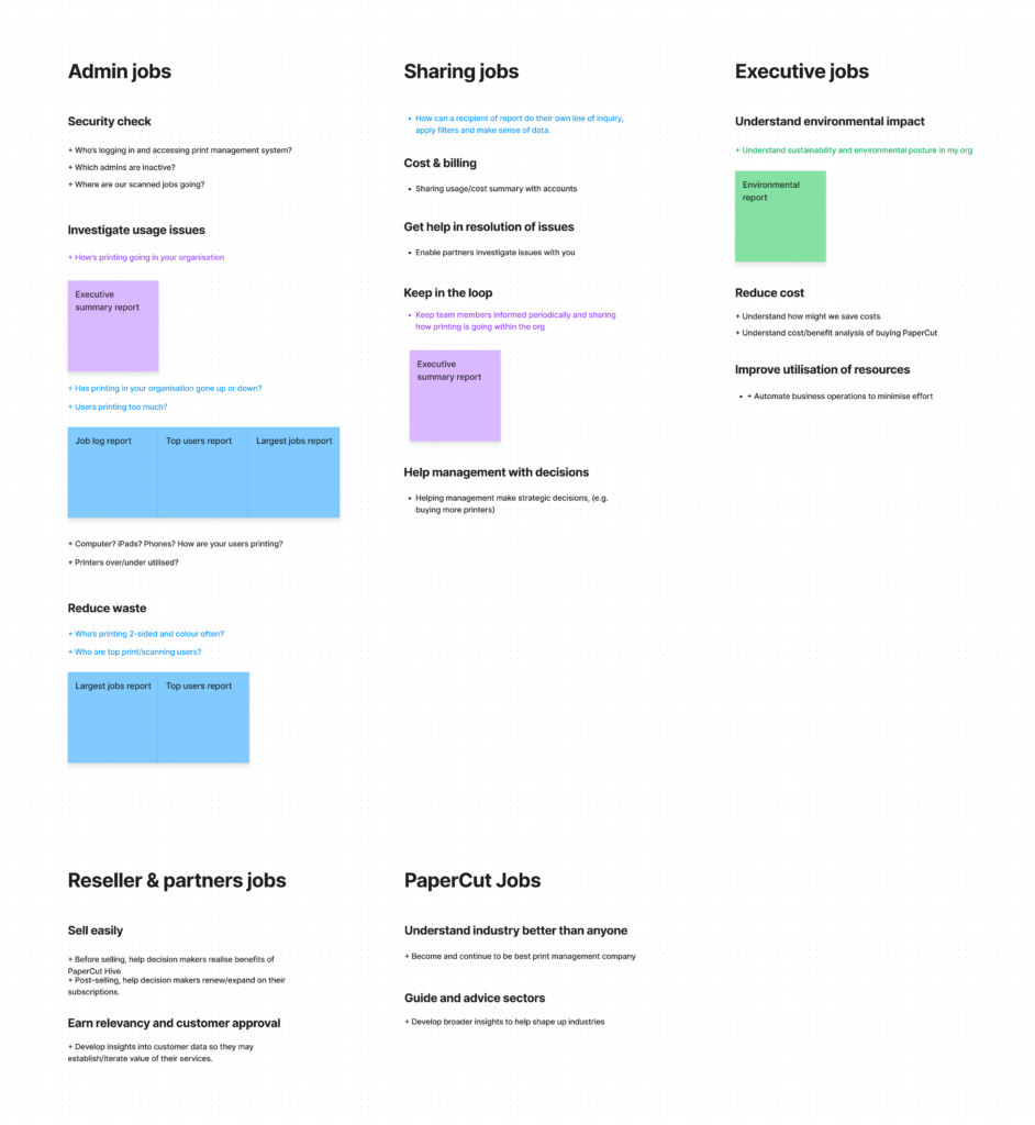
Through interviews with partners and customers across AU, EU, and the Americas, we uncovered three types of users:
- Admins: Wanted help finding cost savings but lacked the confidence to interpret data.
- Executives: Looked for clear evidence of ROI and risk mitigation
- Resellers: Needed plug-and-play reporting to help justify buying decisions.
We mapped out their jobs, context of use, and desired outcomes then cross-referenced it with what our competitors were missing. That gave us our edge.
Key findings
By the end of week three, we’d spoken to twenty-three humans 6 admins, 5 executives, 3 resellers, and 4 IT gatekeepers. Here’s what we uncovered.
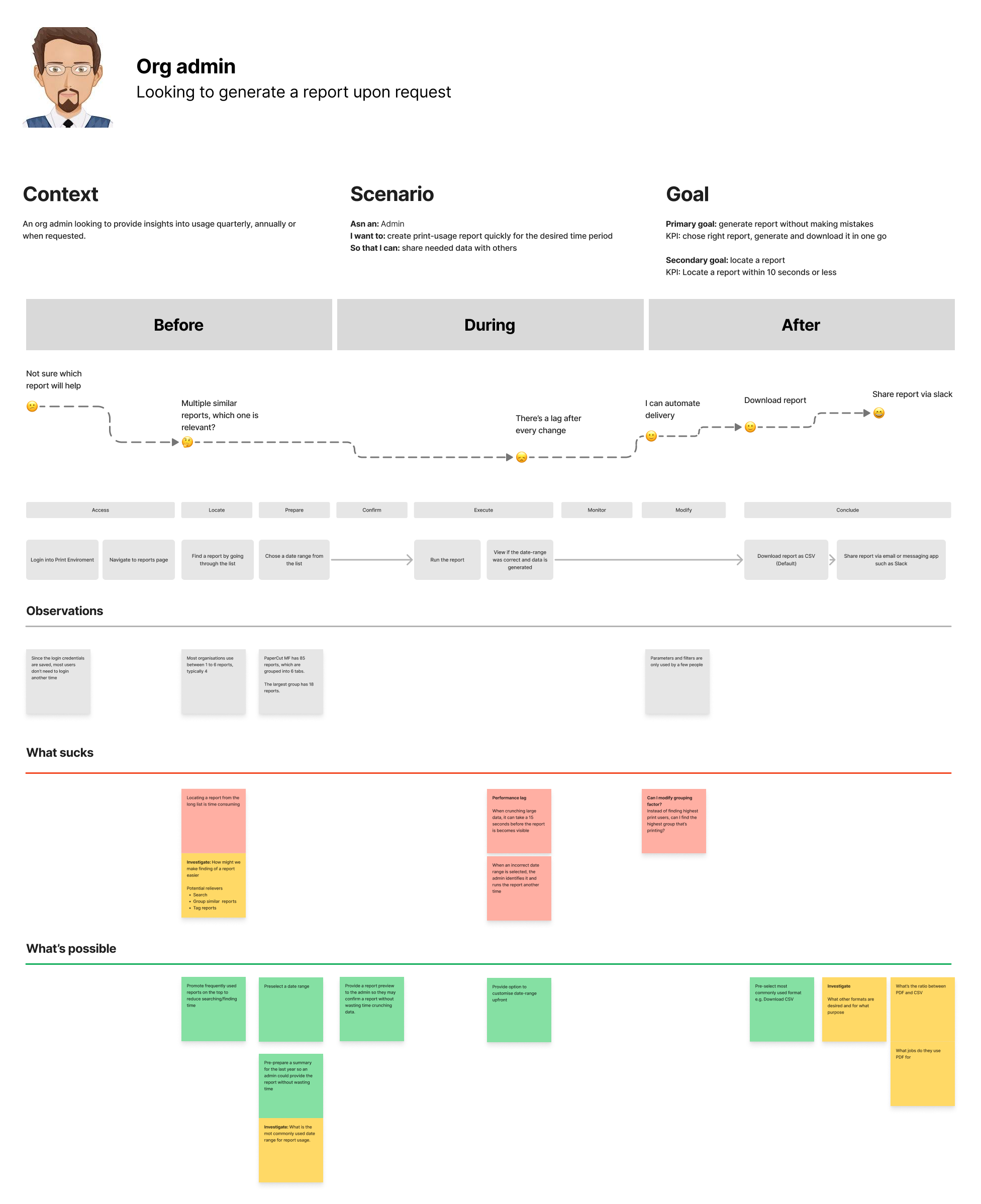
1. Understanding Context
Knowing who the users are and where they are when the problem shows up is essential for design empathy and decision-making.
Admins in schools weren’t analysts. They were staff or operations leads juggling 30 other things, jumping into print logs only when something broke or someone complained.
2. Understanding Jobs and Sub-Jobs
We surfaced the functional purpose behind reporting. What were users really trying to do and what sub-tasks were tied to that?
For admins, reports weren’t analytics. They were alibis. A way to spot waste, investigate abuse, and protect themselves when questioned.
3. Use Cases in Real Life
Reports didn’t exist in a vacuum. They were pulled into meetings, used to prep for conversations, and shared to justify decisions.
Executives opened reports before finance calls or to defend printer budgets to procurement, not to “explore data,” but to explain actions.
4. Pain Points in the Existing System
The old system failed at the exact moment users needed it most.
Every admin pointed to the same flaw: there was no way to link a print job to a person without doing detective work across multiple systems.
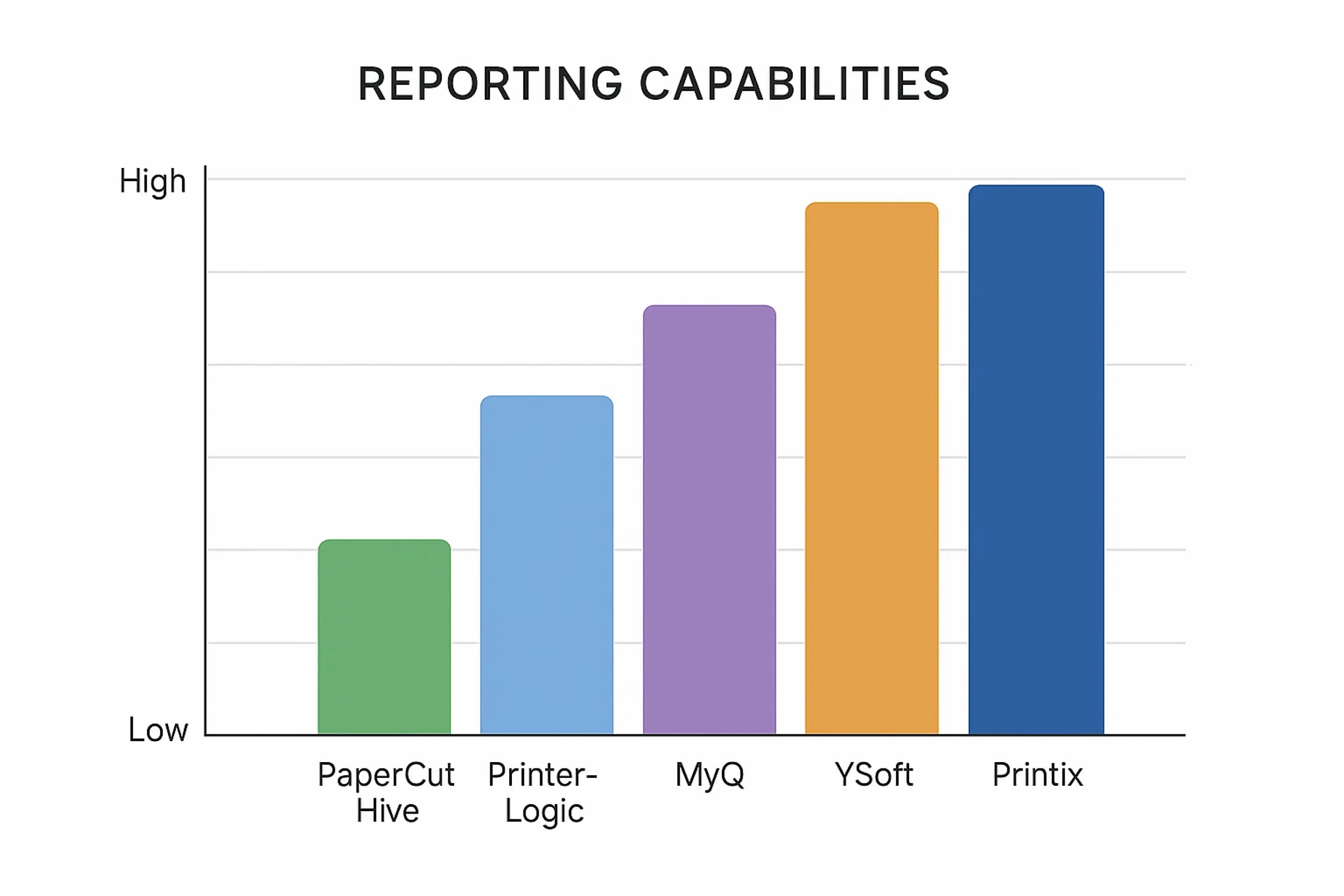
5. Comparative Benchmarks
We looked outside our own walls for inspiration. Who was doing this better?
Looker Studio wasn’t our competitor, but it reminded us what clarity could look like especially how a well-written report summary can guide the eye without teaching the user how to read charts.

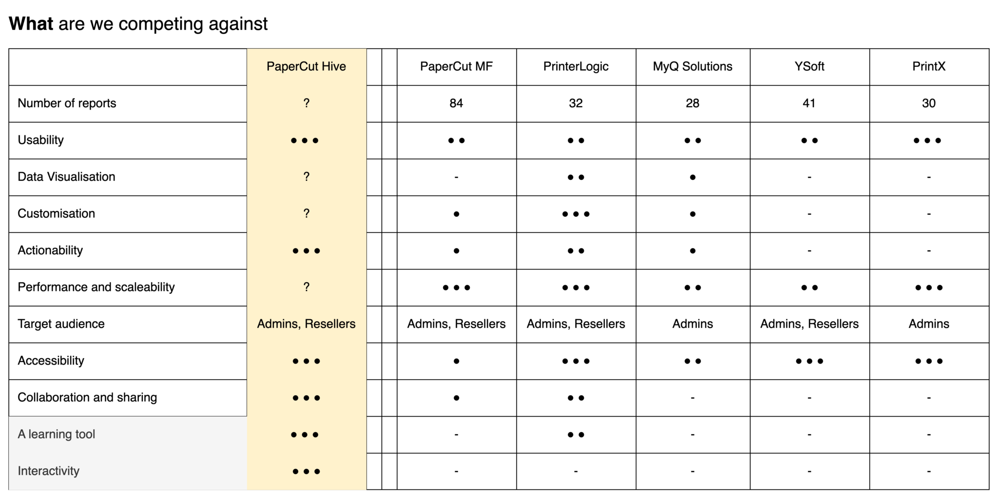
Learning from Competitors
Key Learnings:
- Competitors offered strong visuals but often lacked intuitive navigation.
- Users valued quick-glance insights over data-heavy screens.
- We saw opportunities to simplify workflows that competitors overlooked.
By understanding these points, we shaped a reporting experience that felt both familiar and refreshingly simple, turning competitor insights into our competitive edge.
Brainstorming
The Ideation Phase
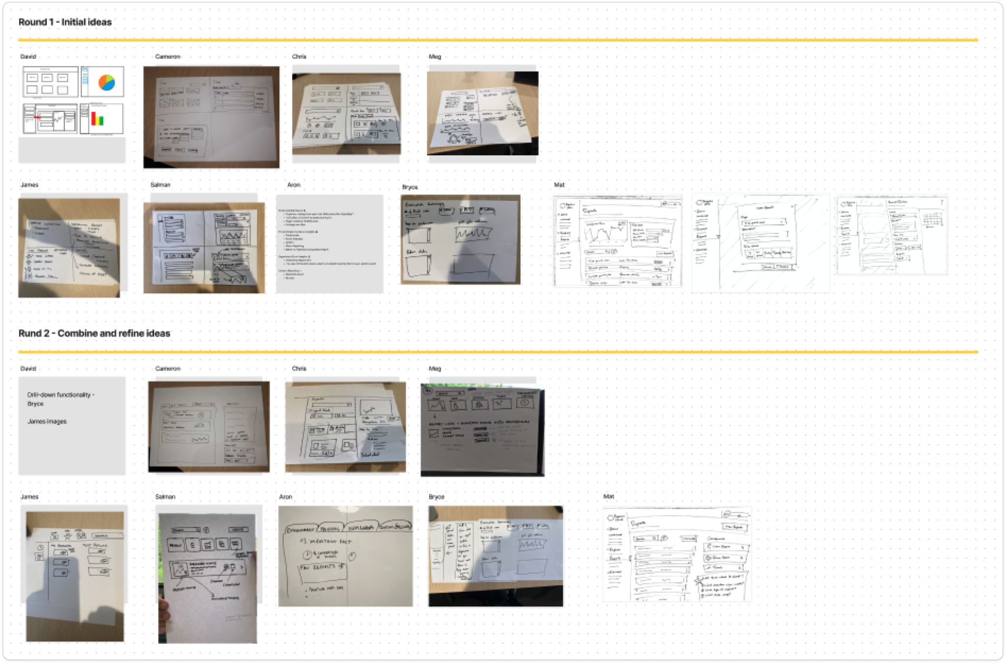
Early Concept Sketches
I conducted at 4up/6up ideation session with the team inviting members from technical support, marketing and PMs from server-based products to brainstorm thoughts how might we provide a solution to key problem areas identified in the discovery phase.
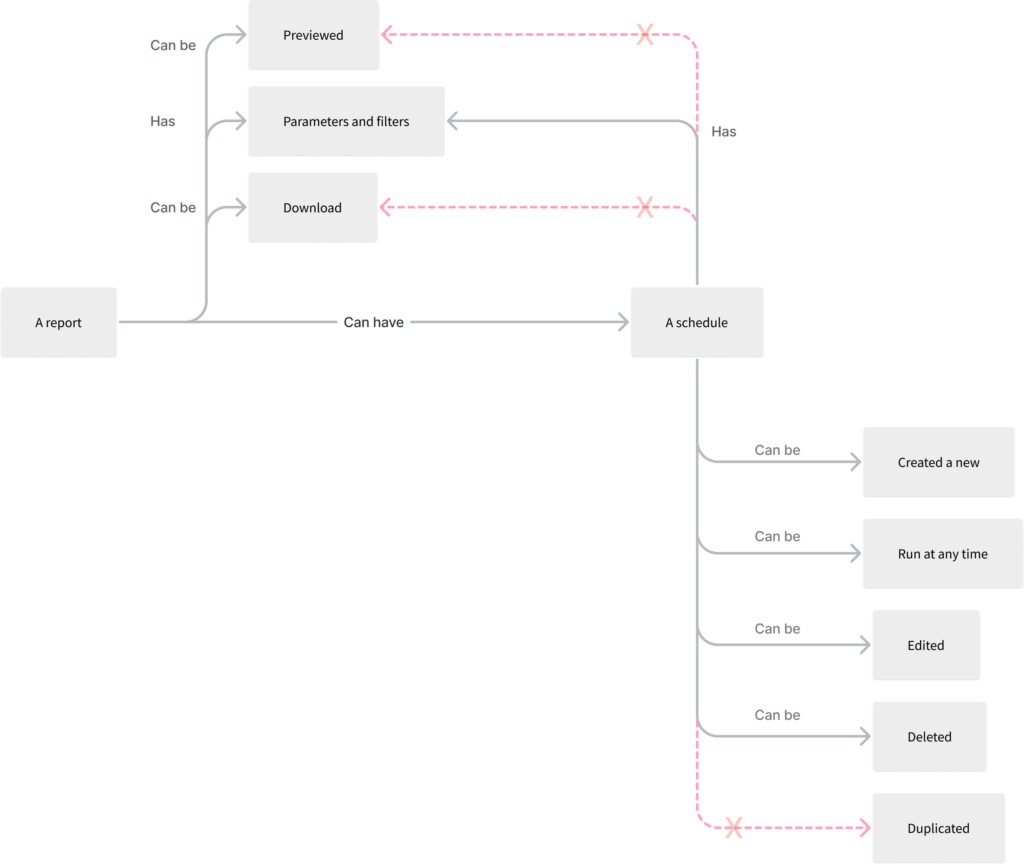
Functionality Mapping
Functionality mapping is a powerful tool for understanding the relationships between different entities within a complex system, particularly those involving shared operations and processes. By visualizing these connections, we can identify potential bottlenecks, redundancies, and opportunities for optimization.
Converting Ideas into Possibilities
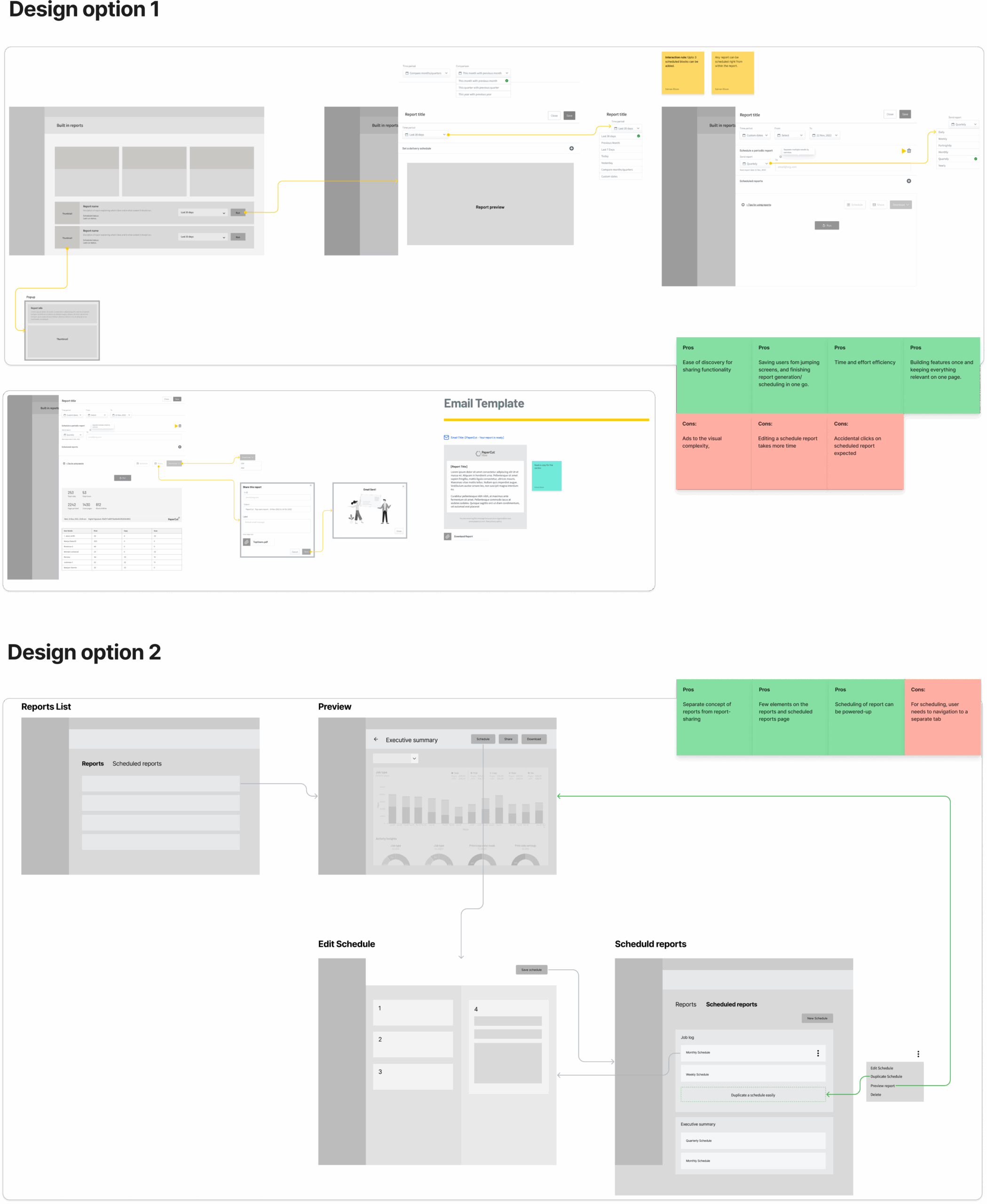
I mapped out several low-fidelity user flows to design a simple, efficient path—allowing users to find and create a report in three clicks or fewer. Using Figma, I explored multiple design directions.
Design Option 1: The report editor opens in a side sheet, following the app’s existing interaction patterns and maintaining interface consistency.
Design Option 2: The editor loads as a dedicated full-page view, offering a more focused design space.
Evaluation with stakeholders
Once the core idea was shaped, I invited early input from the Trio (tech lead, product owner, and SME), along with marketing stakeholders. The goal: stress-test the direction across four dimensions.
- Technical Fit: Confirmed the solution could scale, work within the current product architecture, and wouldn’t create performance or maintenance issues.
- User Experience: Ensured the flows were intuitive, addressed known pain points, and reflected real user behaviours.
- Business Goals: Aligned the design with key product KPIs and commercial outcomes.
- Messaging & Positioning: Collaborated with marketing to shape a simple story that clearly communicated the value and fit the broader go-to-market narrative.
Maturing conceptual design
The Design Phase
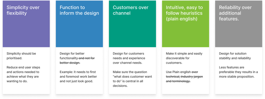
Design Principles
Knowing the users we were designing for, we identified and prioritized simplicity flexibility and functionality to inform the design. Some core design directives are listed below:
- Priorities Simplicity over functionality
- Prefer customer over resellers needs
- Easy, intuitive and learnable
Mid and High Fidelity Design
Once core ideas are clear, I select the strongest design path and begin refining it into mid- and high-fidelity prototypes. When there’s uncertainty or split opinions, I take time to mature multiple options then validate them through A/B testing.
This keeps the process grounded in clarity, not guesswork.
Initial testing
Testing Prototype
Improving design as per user feedback
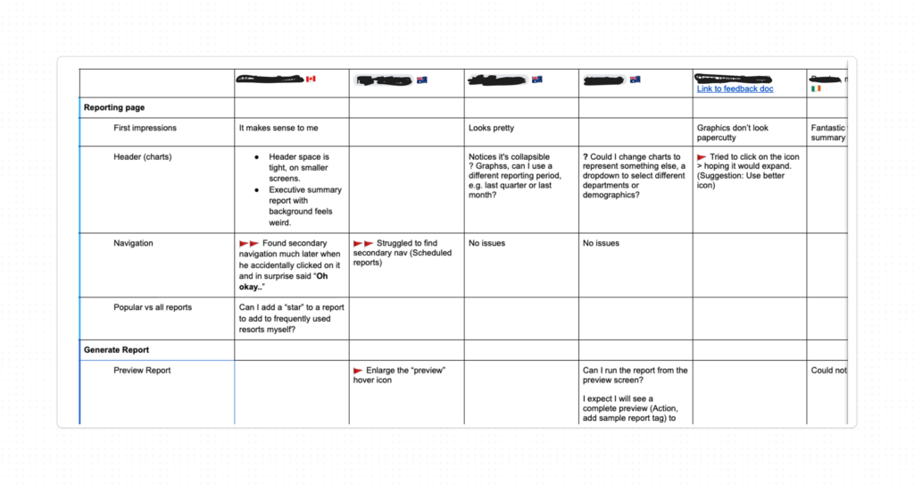
I created a clickable Figma prototype from the high-fidelity design, ensuring it was meticulously prepared for testing. After an initial copy review, the design was presented to resellers and customers for feedback.
What is working
- Reports as a learning tool: To assist admins, each report preview included a summary explaining its use, becoming a valuable resource for new admins to select appropriate reports for different contexts.
- Ready-to-download reports: The summary report, highly used in the server-based platform, was well-received as a pre-generated, one-click download.
- Efficient reports generation: Users valued the pre-selected reporting periods, enabling accurate reports from the start. With just two clicks, users could select, generate, and download reports, an efficiency that garnered appreciation.
What needs to be better
- Below the fold navigation: Initial tests revealed usability issues with navigation elements placed below the fold, causing user difficulty in finding them.
- Download as PDF: Users consistently requested report downloads in PDF format, favoured for record-keeping and interdepartmental sharing, prompting its prioritisation in the next release.
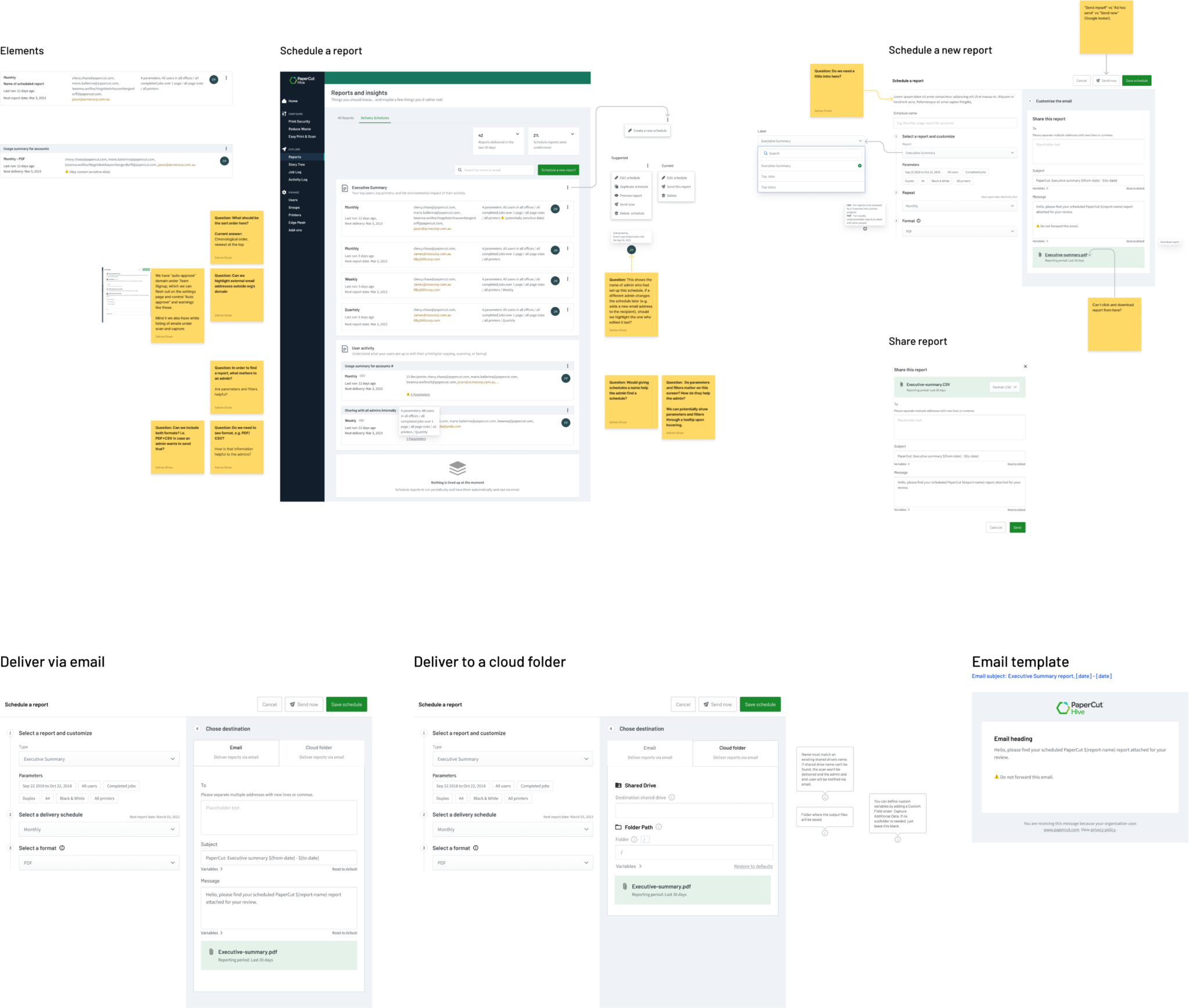
- Share report via email: Noting a preference for sharing over downloading, we introduced an email sharing feature in the first release and planned future scheduling capabilities, ensuring each update meets user needs and improves experience.
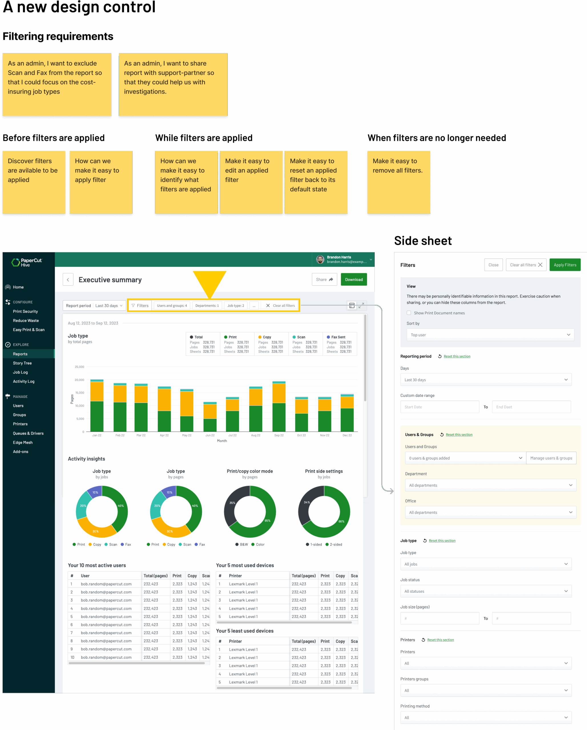
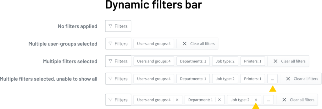
Designing a new control
During testing, we observed that admins kept switching between filters and the report view to spot patterns and make sense of the data. To reduce this friction, I introduced a dynamic filters bar, a new control placed above the report that made it easier to view, add, or remove filters without breaking focus.
Testing
Design iterations
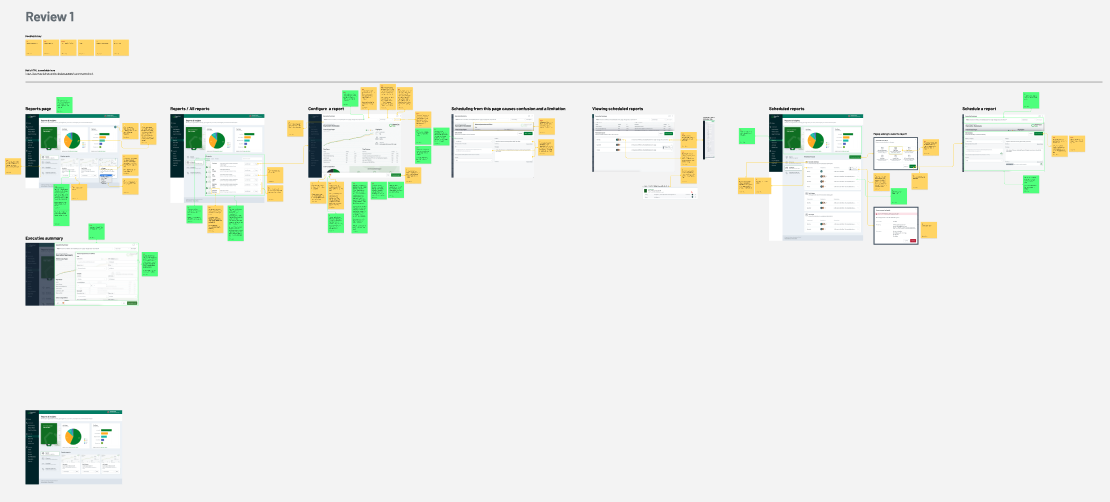
1st Design iteration
Initial feedback from four resellers and internal subject matter experts was encouraging. The reports gave administrators clearer insights, actionable learnings, and a stronger sense of control. Building on this feedback, we resolved key communication gaps and visual design issues significantly improving the clarity and overall learnability of the reports.
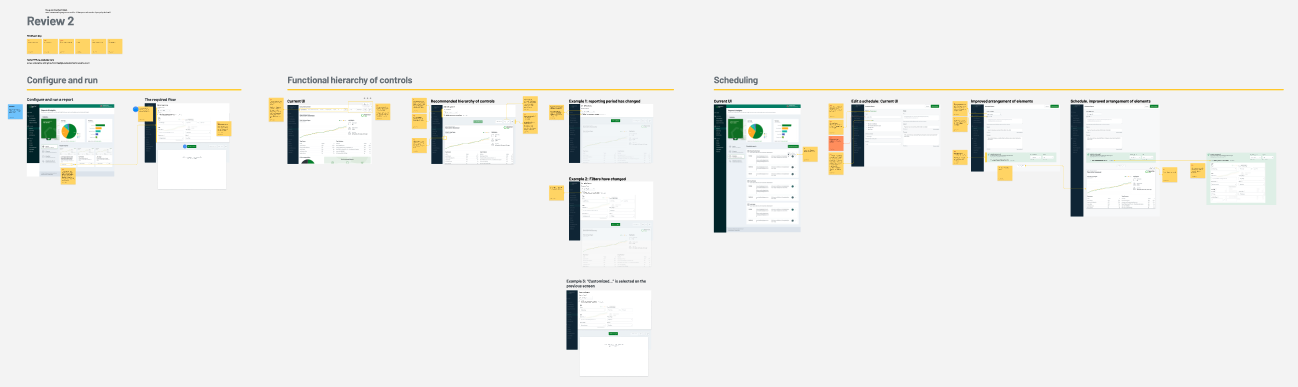
2nd Design iteration
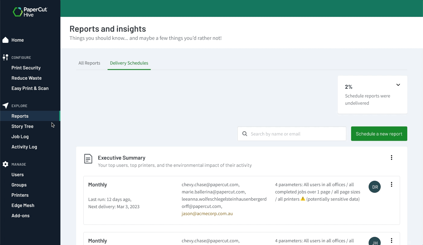
In the initial design, scheduled reports were mixed into the main report list, creating confusion. Users could reschedule the same report multiple times with different parameters, adding unnecessary visual clutter. This blurred the line between core reports and their scheduling logic. In the next iteration, I separated the two, giving users a clearer and more focused experience.
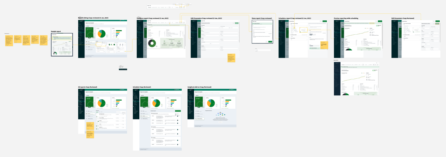
3rd Design iteration
The third design review focused largely on messaging specifically, setting clear expectations for what’s coming next, such as advanced analytics tools and URL-based report sharing. With this feedback incorporated, the team moved forward to translate the Figma designs into an HTML prototype.
The Outcome
Outcomes & Success
While reports are a standard feature in print management apps, they can play a crucial role in establishing and confirming the ROI and environmental value that customers seek. The reports initiative was rolled out over several releases, starting with four basic reports and essential report generation and viewing capabilities, which were well-received. Here are some key successes of the initial offering.
Feature discovery
62% of customers interacting with it within the first 30 days validating its access and ease of use.
High user engagement
On average, customers download 2.4 reports, against a target of 2 reports each quarter.
Request for new reports
Another sign of user engagement is the growing demand for additional reports, indicating users have received benefit and are eager for more.
Struggling to build a digital product? Let’s talk
I’ll tell you if we can fix it-before we ever schedule a call.