User Experience (UX) layers a great product should have
The user experience (UX) of a product or service significantly influences its success, making the evaluation of UX design imperative to meet user needs and expectations. This article seeks to offer a structured framework for assessing the UX design of a product by dissecting it into various layers of user experience. Through the examination of each layer, ranging from surface-level visual aspects to deeper, long-term impacts, valuable insights into the effectiveness of UX design and its role in enhancing user satisfaction and success can be gained.
Without such a framework, stakeholders may struggle to pinpoint areas for enhancement and optimise the overall user experience.
The glance layer
The glance layer represents the surface-level experience of a product’s user experience (UX), where initial impressions are formed with just a quick look. This layer encompasses visual clarity, emphasis, and the ability to make important elements stand out in a design. It’s akin to judging a book by its cover, providing users with their first impressions of a product. To assess this layer, a brief glance is all that’s needed to discern and discuss its visual appeal.
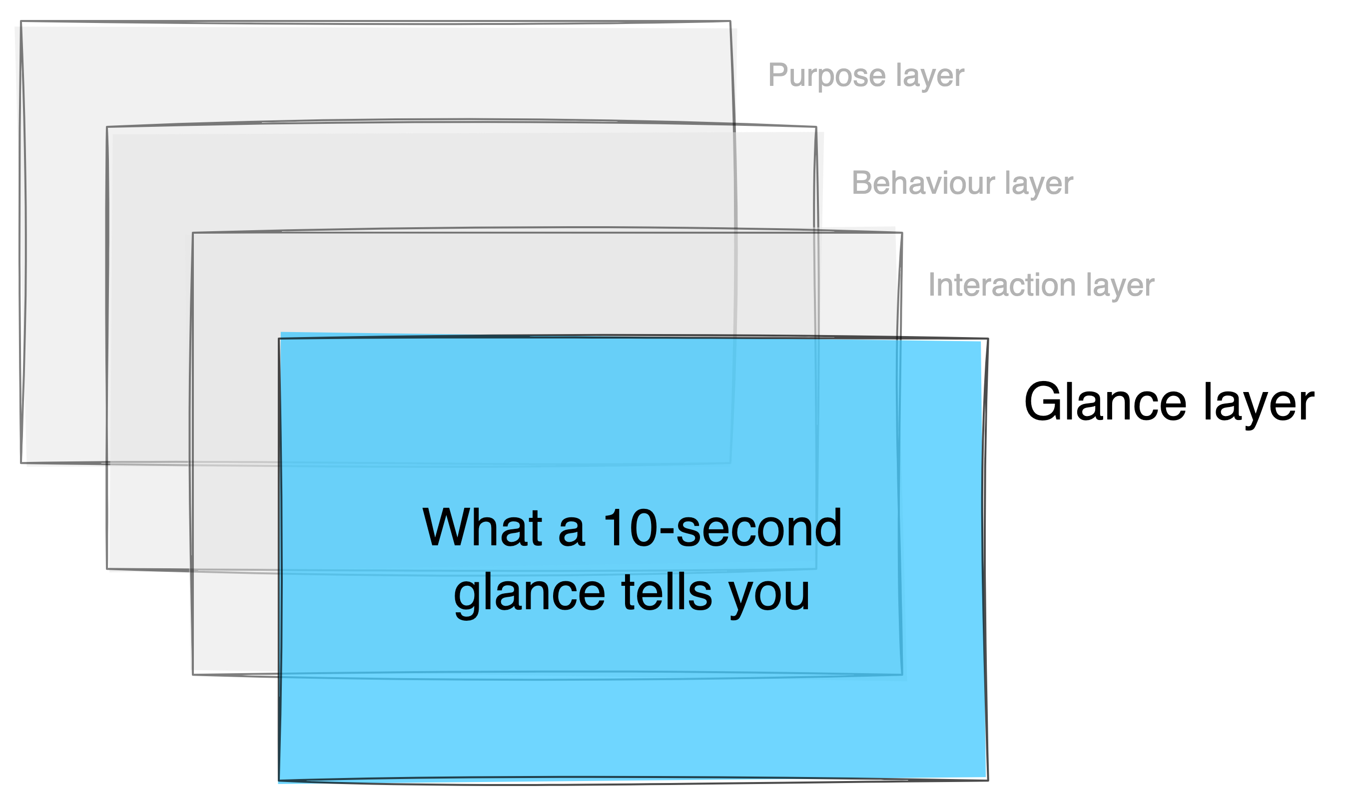
Within the glance layer, elements such as headings, microcopy, design language, colours, and overall visual coherence dictate how users perceive and interact with the product. Essentially, it encapsulates the look and feel of the user experience.
Real-life Parallel
In human interactions, the glance layer is akin to forming initial impressions based on someone’s appearance. When we encounter someone who is visually appealing, well-dressed, or well-groomed, we make snap judgments based on their outward appearance alone. Similarly, the glance layer of a product influences users’ perceptions and sets the tone for their overall experience.
The interaction layer
The Interaction Layer serves as the essence of the user experience, requiring active engagement with the product to fully appreciate its functionality. In contrast to the glance layer, which relies on visual cues alone, the interaction layer demands hands-on interaction to be truly understood. This entails users immersing themselves in the product, navigating its features, initiating user flows, and completing tasks to achieve their objectives. When users interact with an application, they’re essentially engaging with this layer.
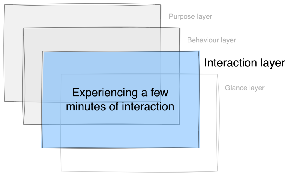
This layer is constructed with UX elements such as navigation, user flows, guided tours, efficiency, simplification of choices, and seamless guidance to facilitate users in accomplishing their goals effortlessly.
Real-life parallel
The Interaction Layer can be likened to someone’s demeanour and mannerisms during an interaction/conversation. Their participation, attentiveness, and care reflect their personality and ultimately influence your decision to continue future interactions with them. Similarly, the Interaction Layer of a product shapes users’ experiences and determines their likelihood of continued engagement.
The behaviour layer
The Behaviour Layer delves into the subtle yet transformative aspects of user experience that only reveal themselves with prolonged use of the product. Unlike the more immediate interactions of the glance and interaction layers, the behaviour layer emerges over time as users integrate the product into their daily routines. It requires users to live with the product, allowing them to witness how it shapes their habits and enhances their productivity.
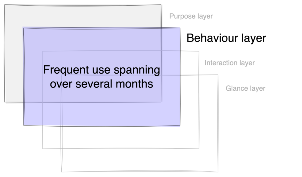
Success in the behaviour layer is measured by the product’s ability to create and transform habits, seamlessly integrating into users’ way of working. It’s not just about completing tasks efficiently but about fundamentally altering the way users approach their work, saving time, reducing waste, and enhancing productivity on a regular basis.
Real-life parallel
Imagine striking up a conversation with someone for thirty minutes that is both visually appealing and interesting. But the real them and their genuine concern for your welfare only become apparent when you work or live with them. Similar to this, in the digital realm, an app could first appear to be tailored to your interests, but eventually it becomes clear if it really meets your requirements or whether its primary focus is on achieving its own corporate goals.
Purpose layer
The purpose layer is much more concealed and not evident until you have spent a significant amount of time with it. This is the layer where experience becomes integrated into the overarching goal of why a product or business exists and what it is intended to leave its consumers after a few years of use.
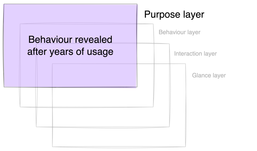
Purpose layer is a direct question on an applications’ reason-to-existence and the end-goals it is aiming to achieve for its users.
Elements of the product that go into this layer are applications’ vision, values and goals and the genuineness of those goals towards helping people grow, succeed and thrive in their life. Today’s top social media platforms claim to prioritise connecting people, but their main objective is often profit, leading to exploitation and harm to users’ well-being. While platforms require financial viability, a subscription model is more user-friendly and ethical than ad-based systems focused on profiling and manipulation.
Real-life Parallel
Today’s top social media platforms claim to prioritise connecting people, but their main objective is often profit, leading to exploitation and harm to users’ well-being. While platforms require financial viability, a subscription model is more user-friendly and ethical than ad-based systems focused on profiling and manipulation.
Concluding
Measuring UX is complex, but this framework simplifies evaluation by focusing on different layers. By dissecting user experience, it highlights areas needing improvement. Utilising this framework helps optimise products for better user engagement and satisfaction.

